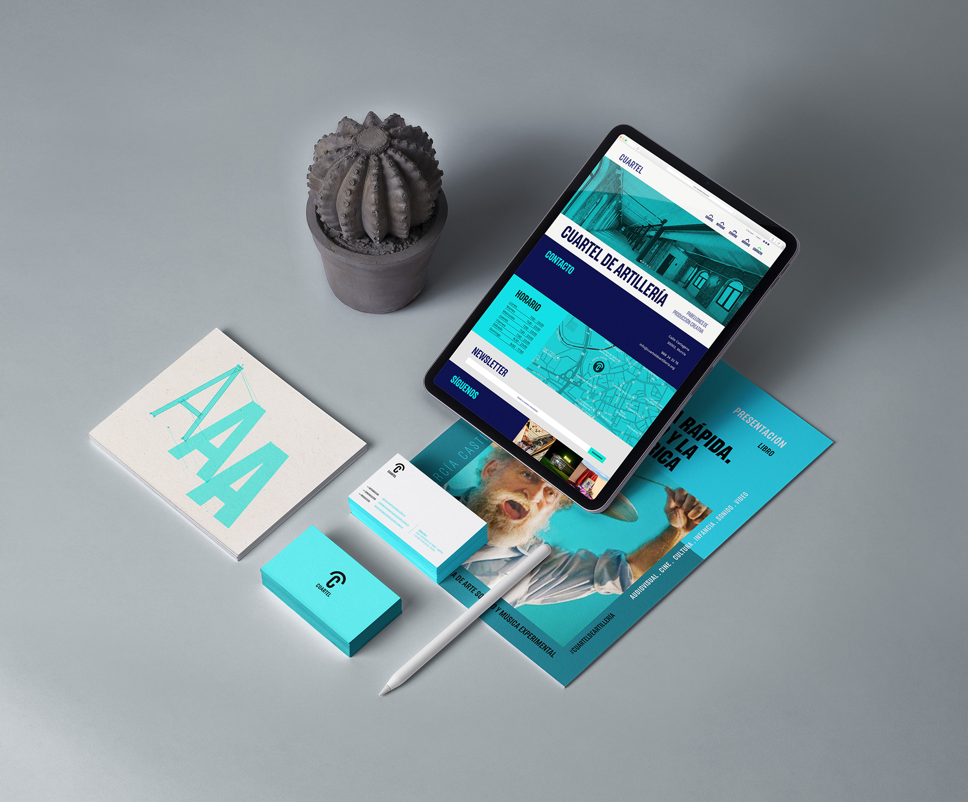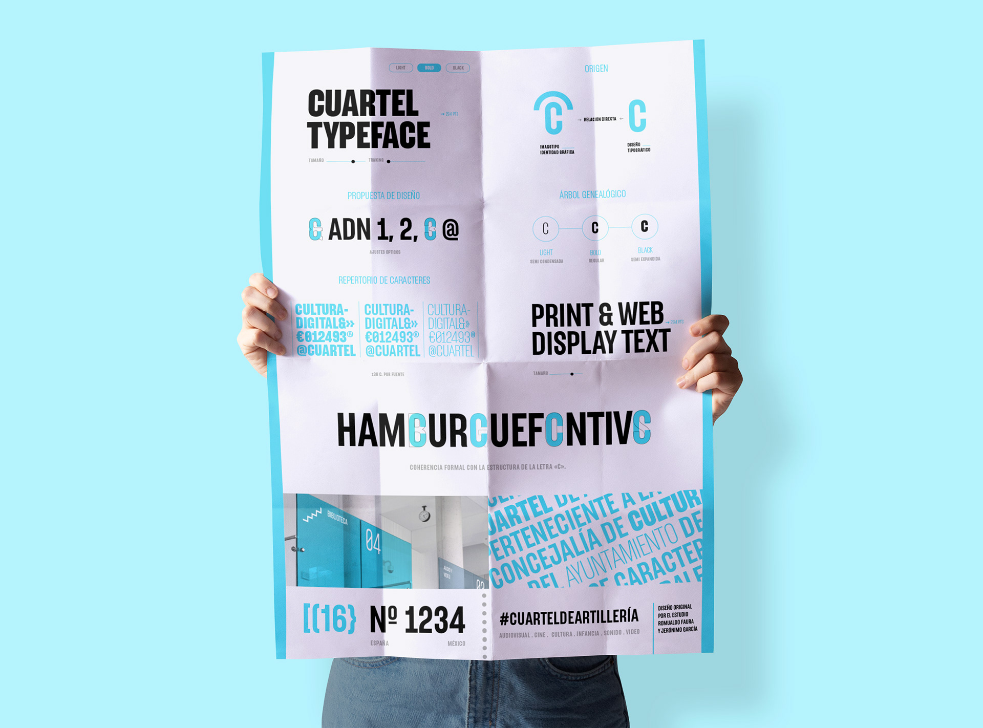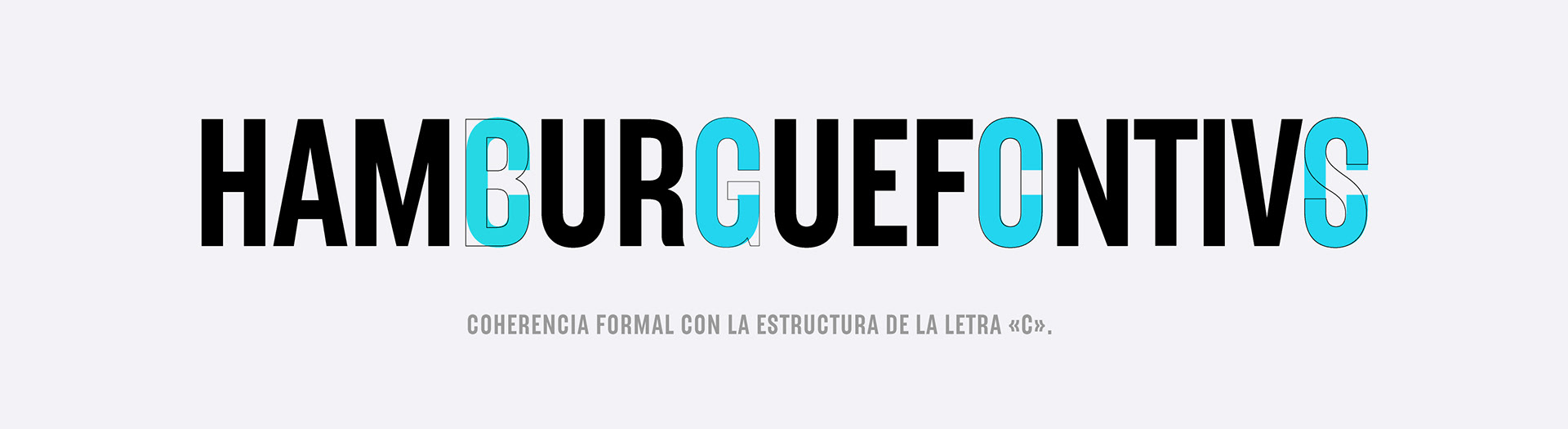
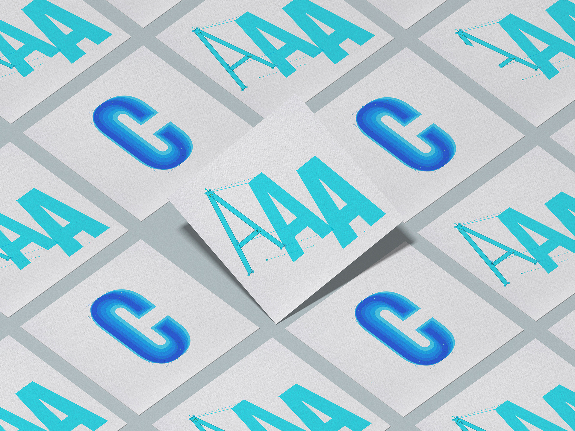
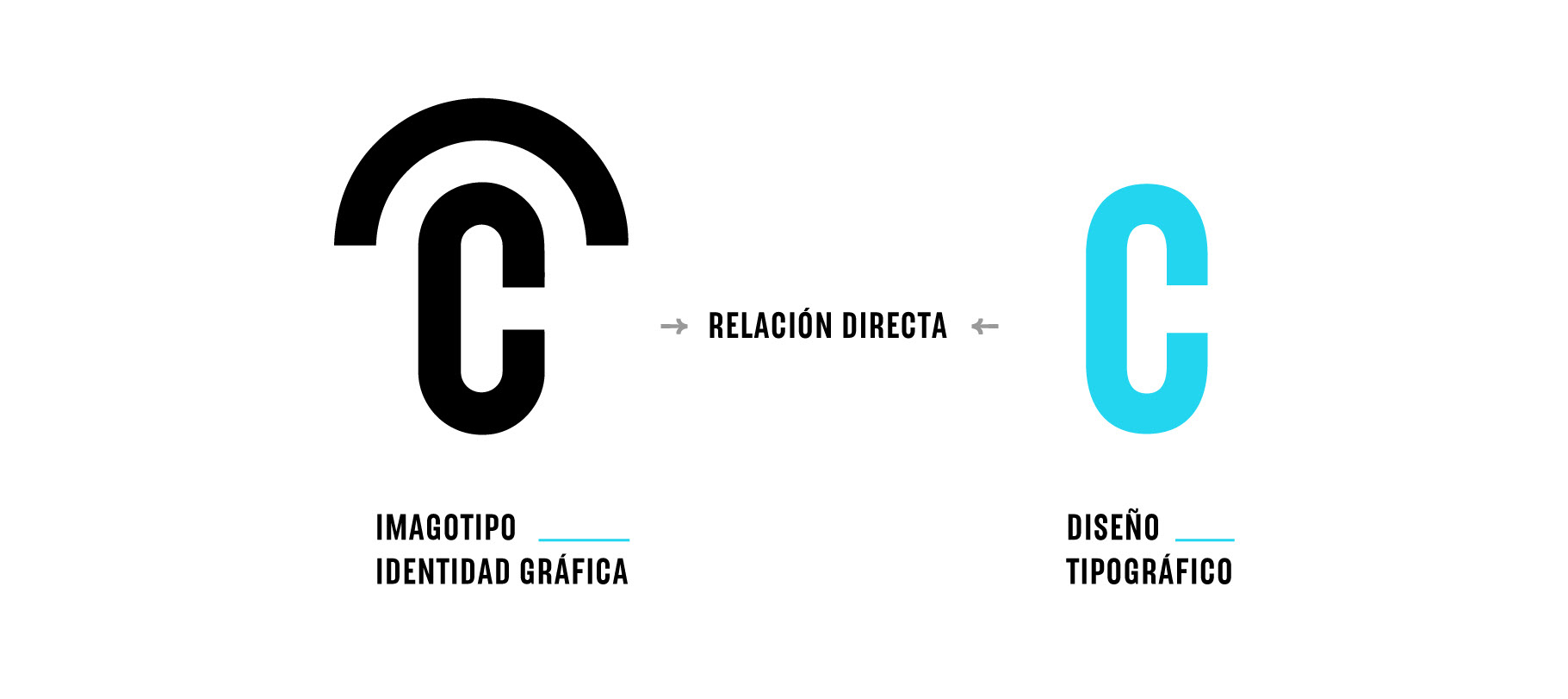
The Cuartel bold font was designed through the Romualdo Faura studio and with the help of Momutype, it became the Cuartel typeface family. The design of the font was developed by Romualdo and Jerónimo García, who presented the drawing of the bold in Illustrator to the studio. They shared with us how the basis of their proposal was based on the design of the graphic identity that has been designed for the Murcia Spain Cuartel de Artillería, where the letter C was the main actor and the basis for all the design of the characters, especially of the curves.
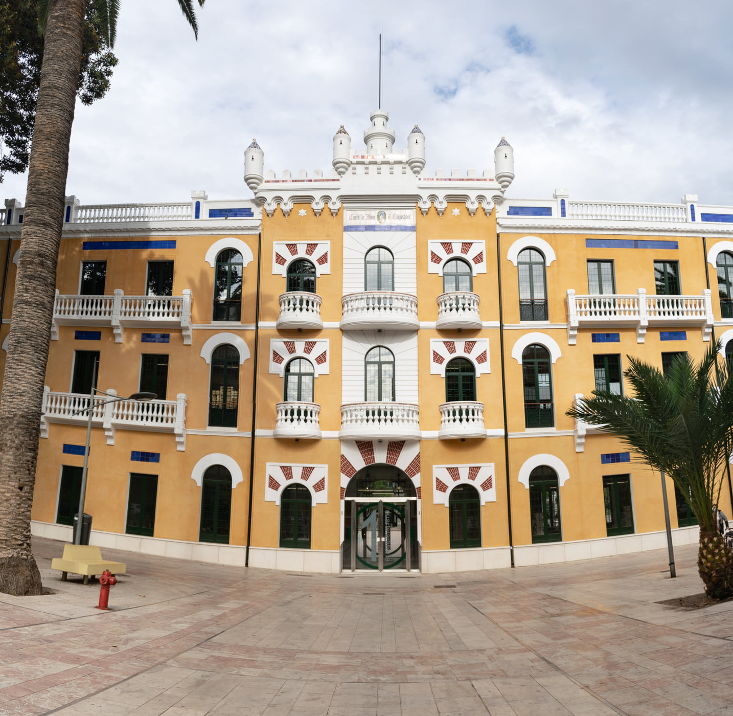
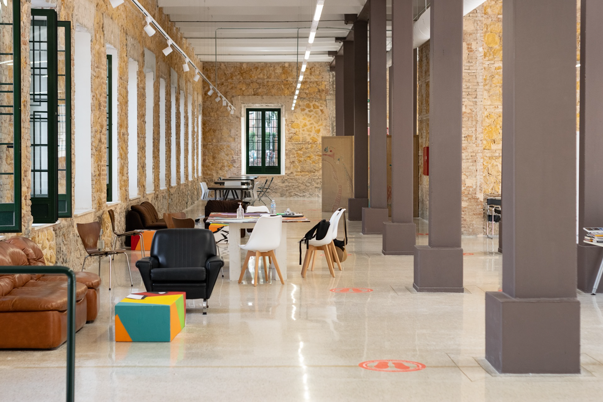
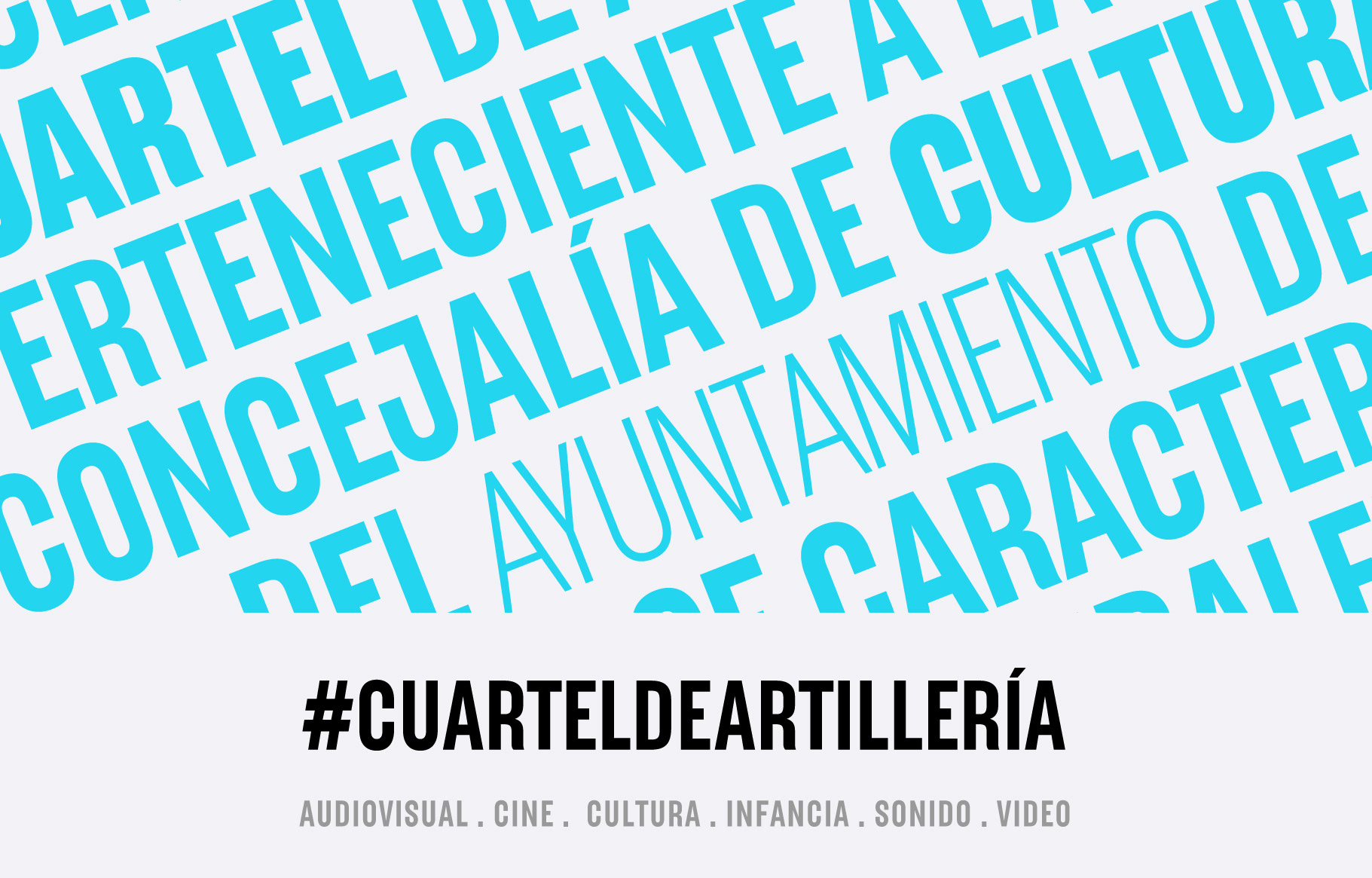
Images taken from the Facebook of the Cuartel de Artillería.
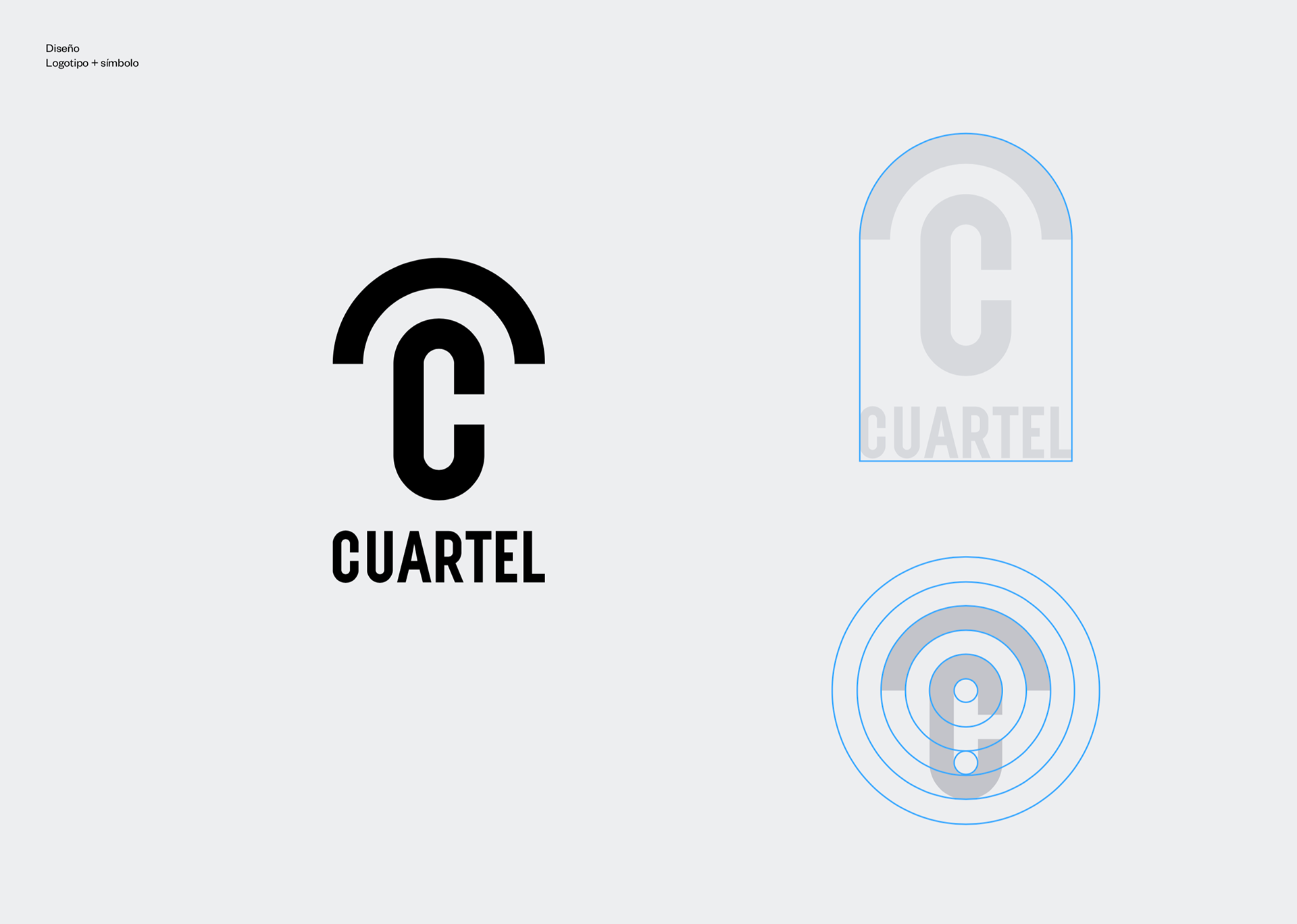
Original Design
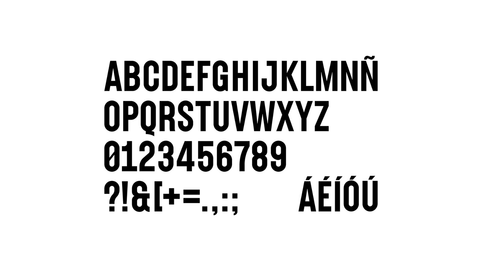

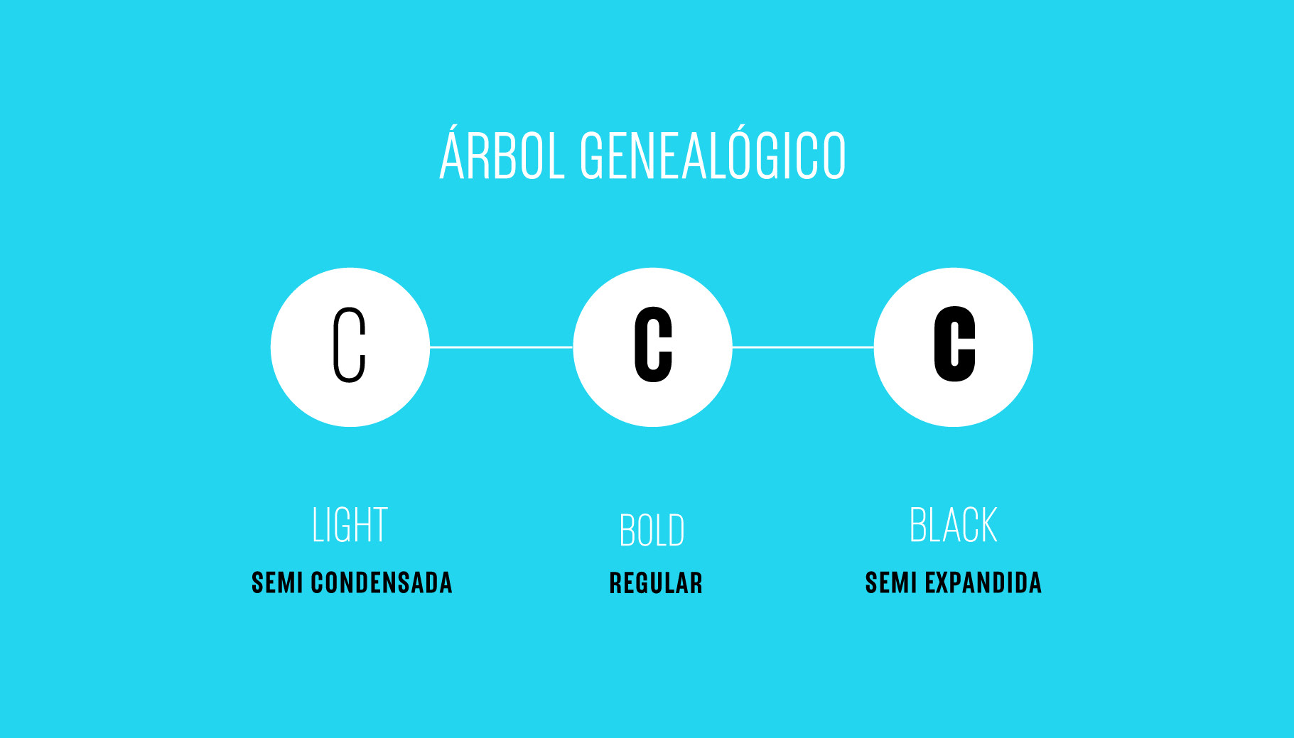
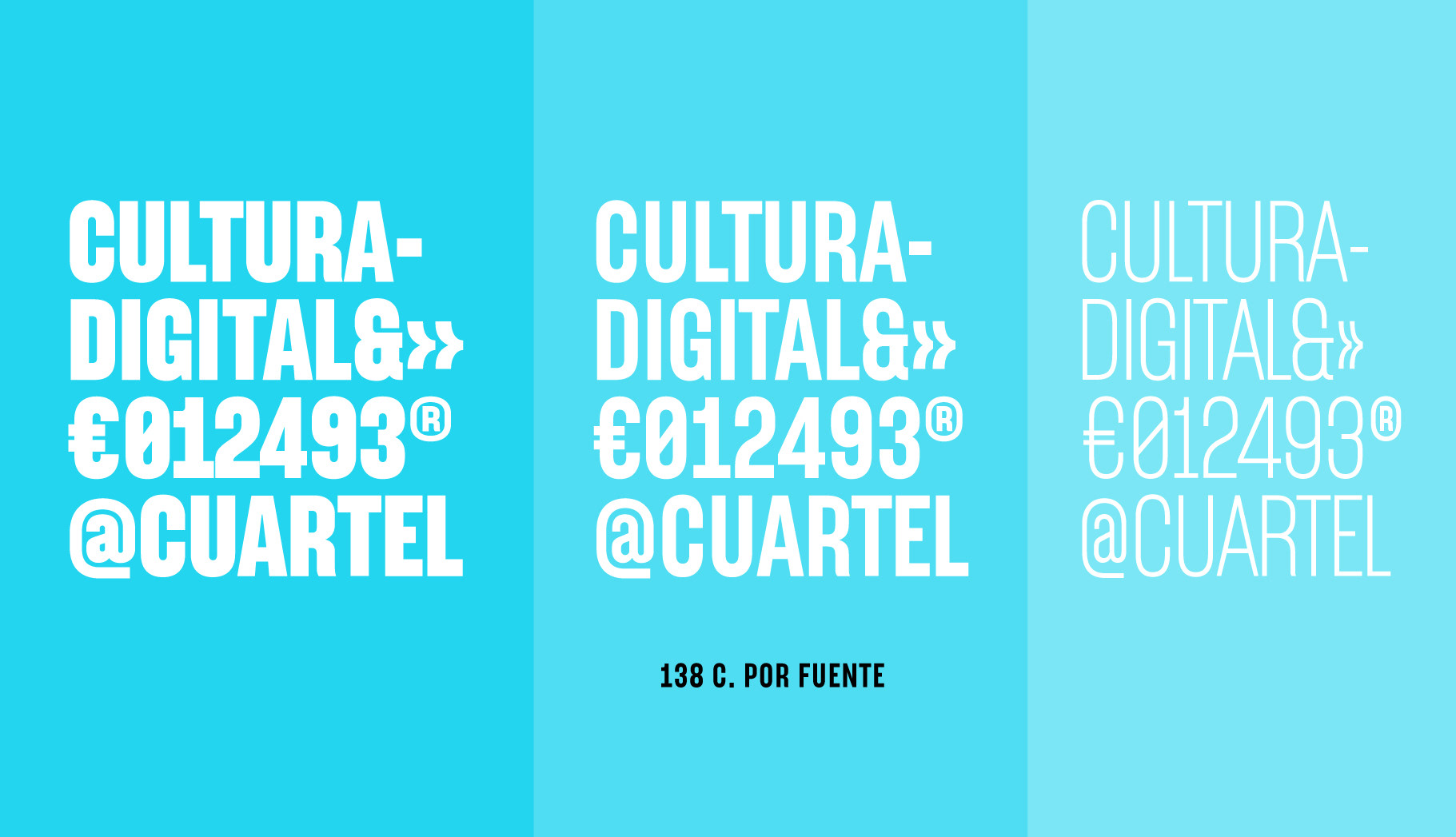
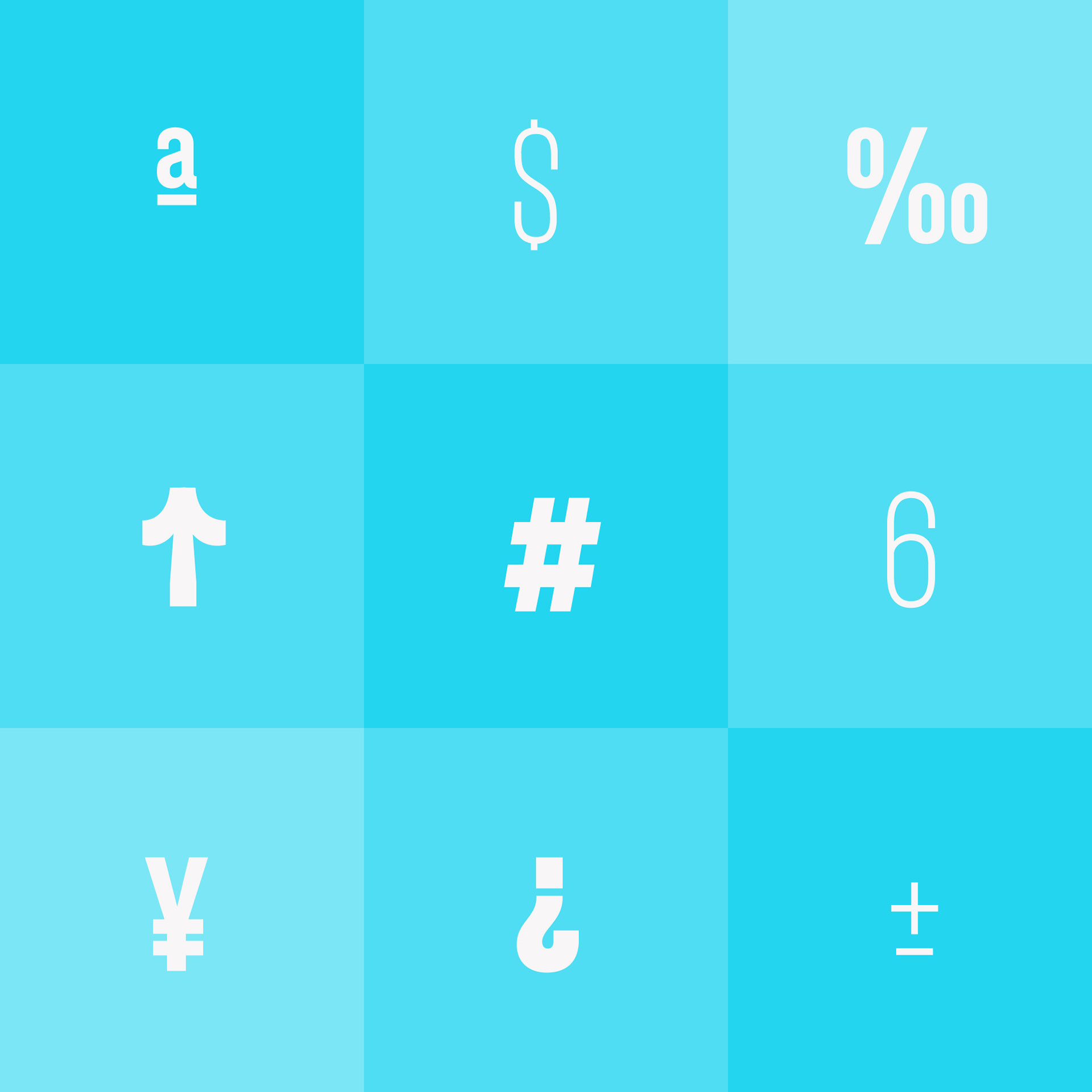
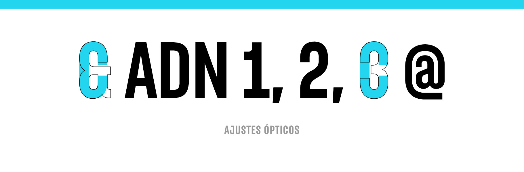
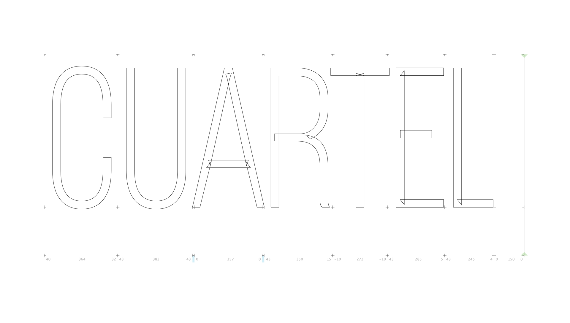
Momutype analyzed the proposal and transferred the characters sent by the studio to the Glyphs typographic software to make optical adjustments, unify weights, ink traps and everything necessary for their correct formal coherence and design the missing characters for use in Spanish and English.
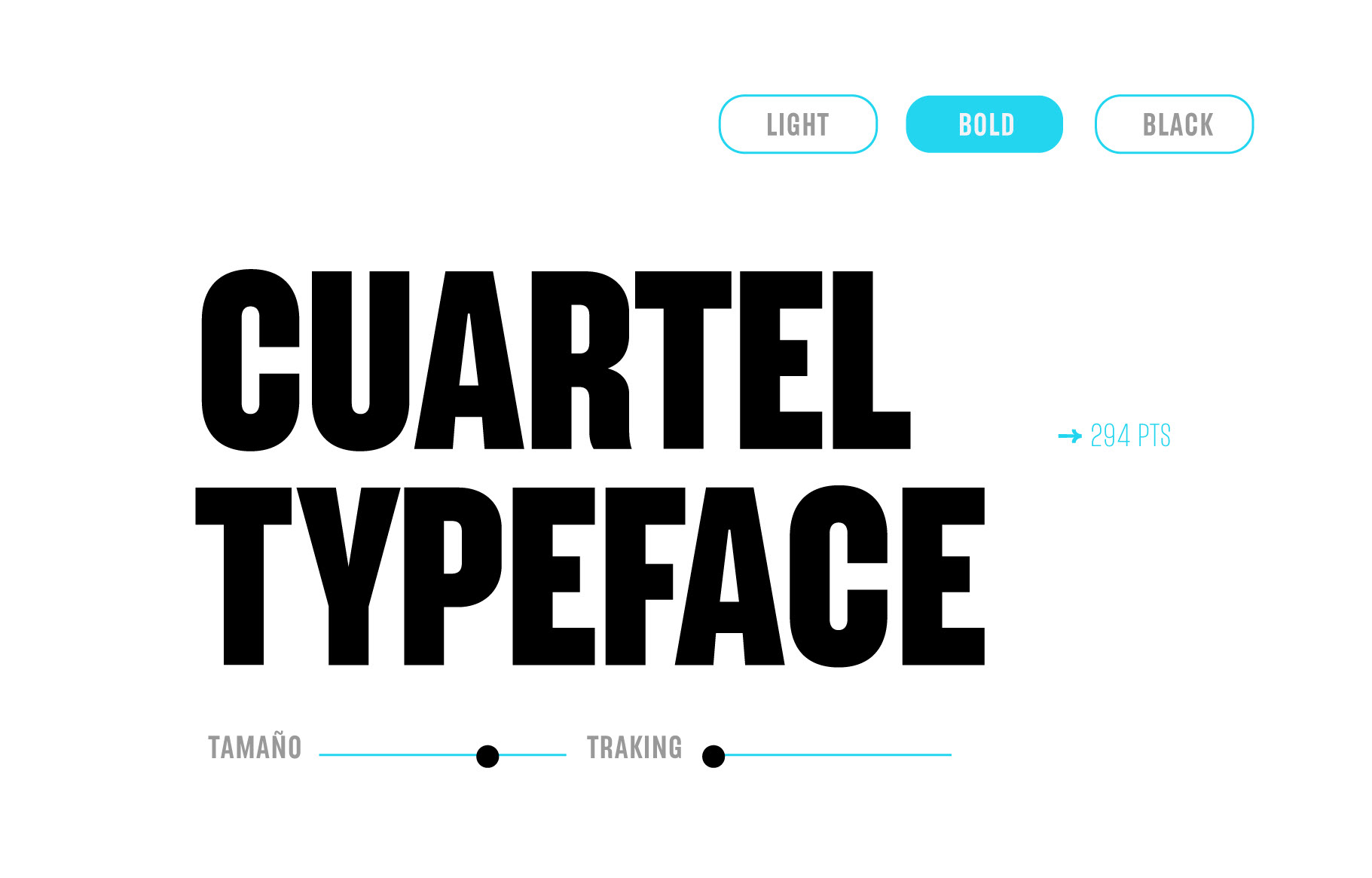
Thus, through good communication and corrections, it was concluded with the bold font and the master of the light was designed with an extrapolation of black.
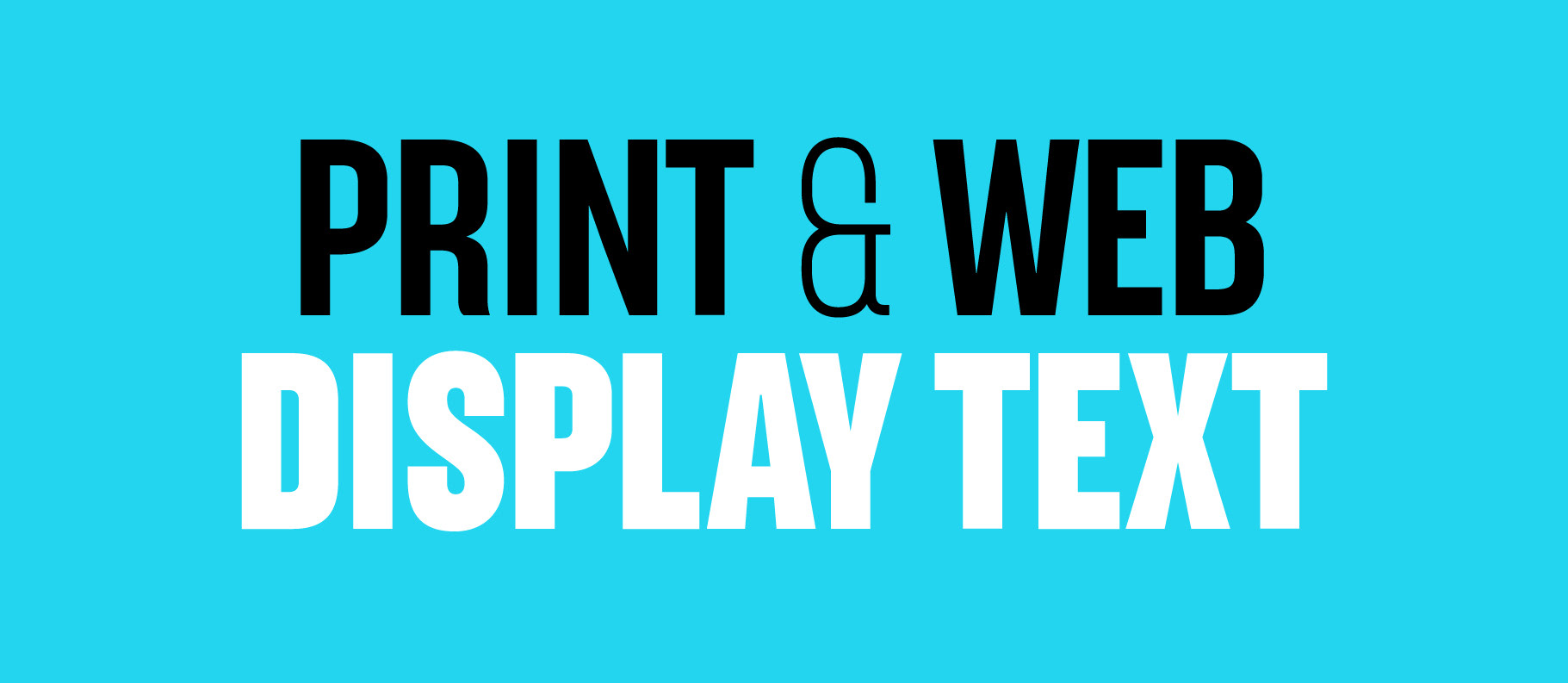
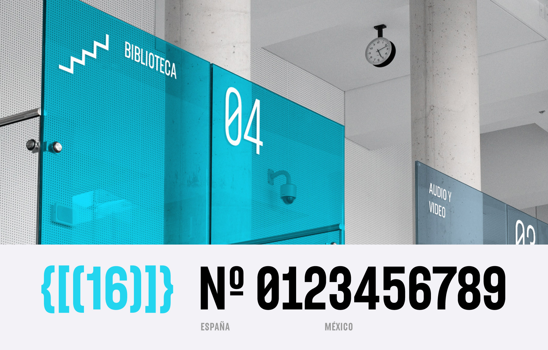
With the help of the Sumotype foundry based in Colombia, the exchange of comments and design, production of the typeface family for use in print and on the web was finalized.
We thank the Romualdo studio for trusting Momutype Foundry and thanks to Frida Medrano for the recommendation.