
Cover tests
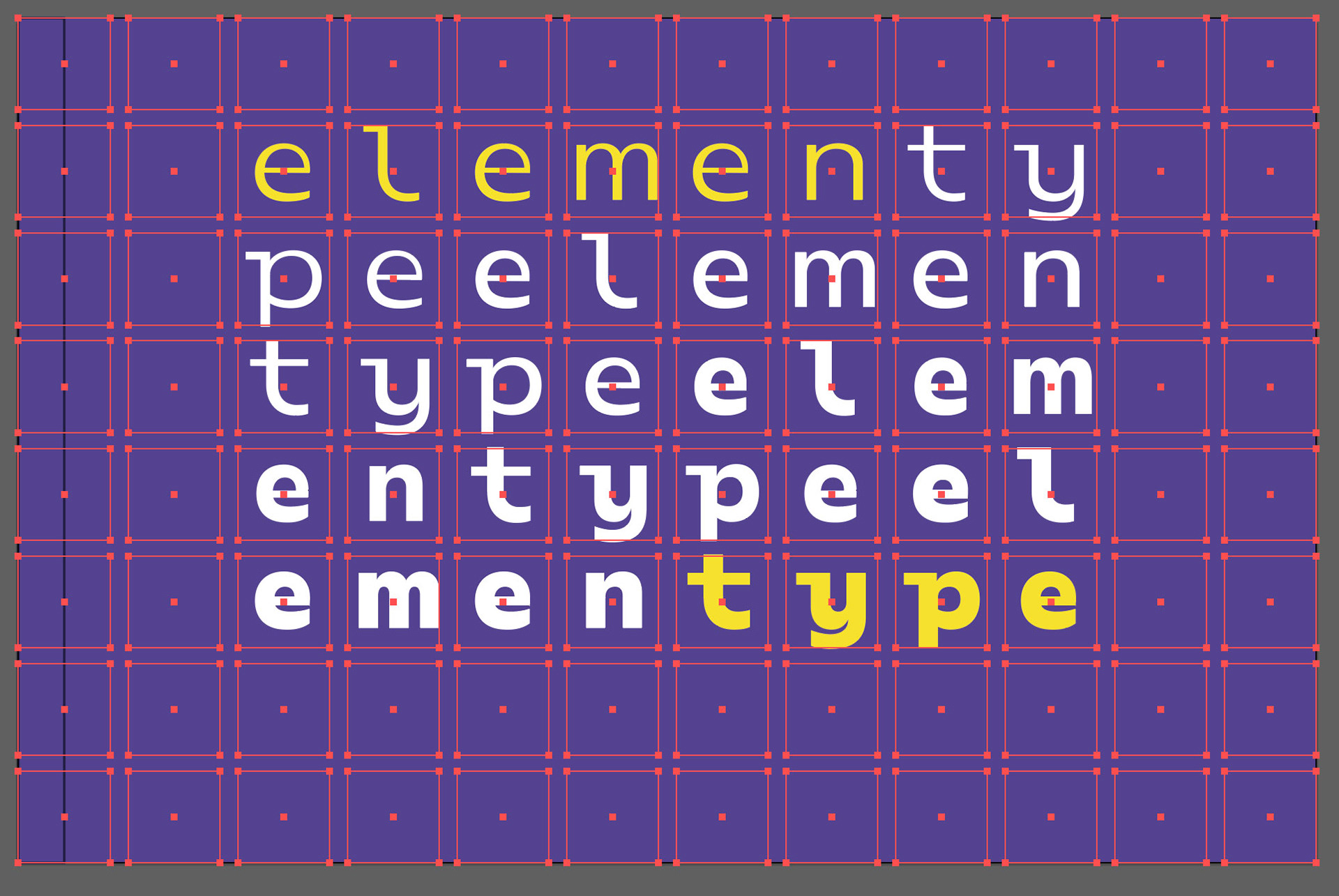
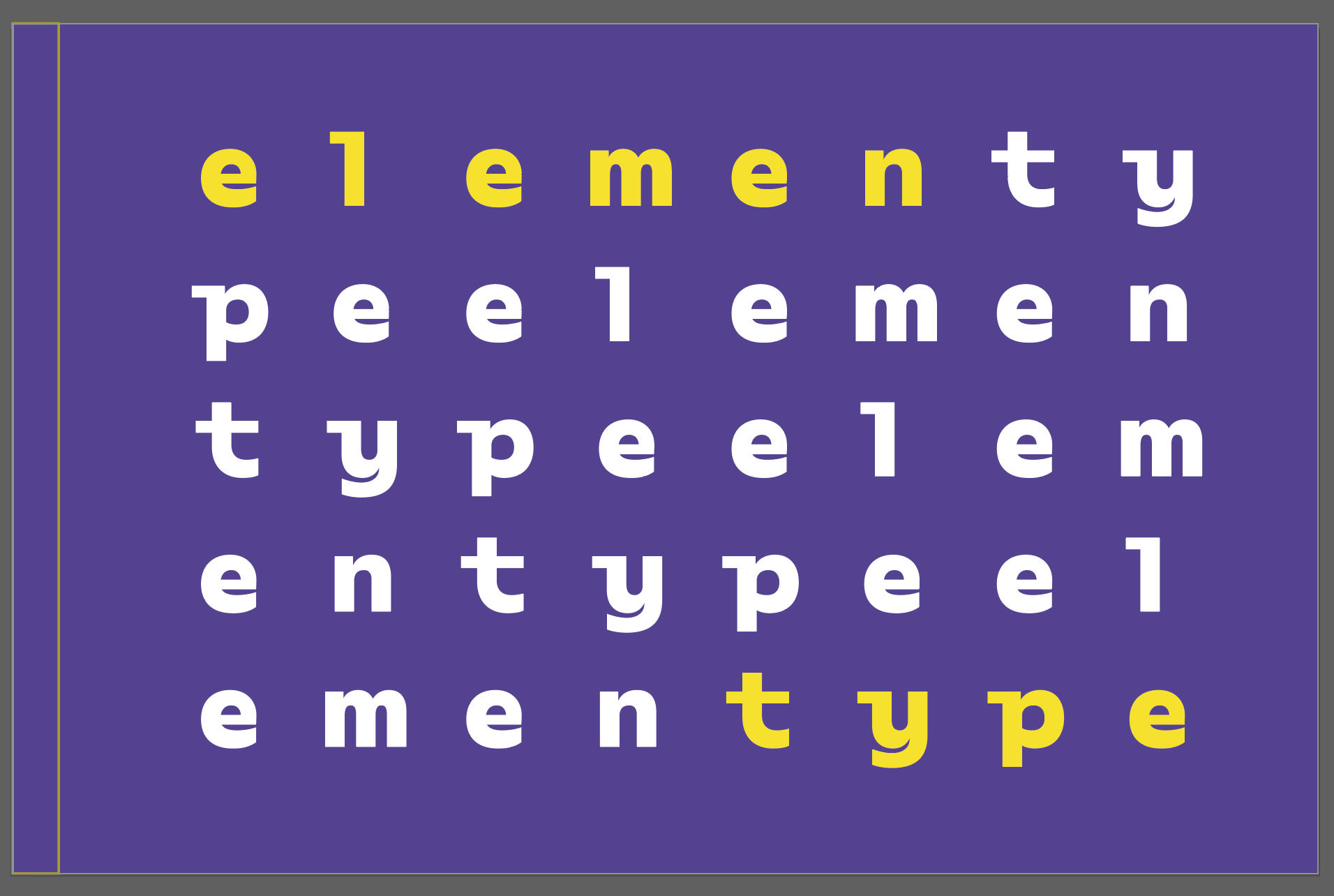
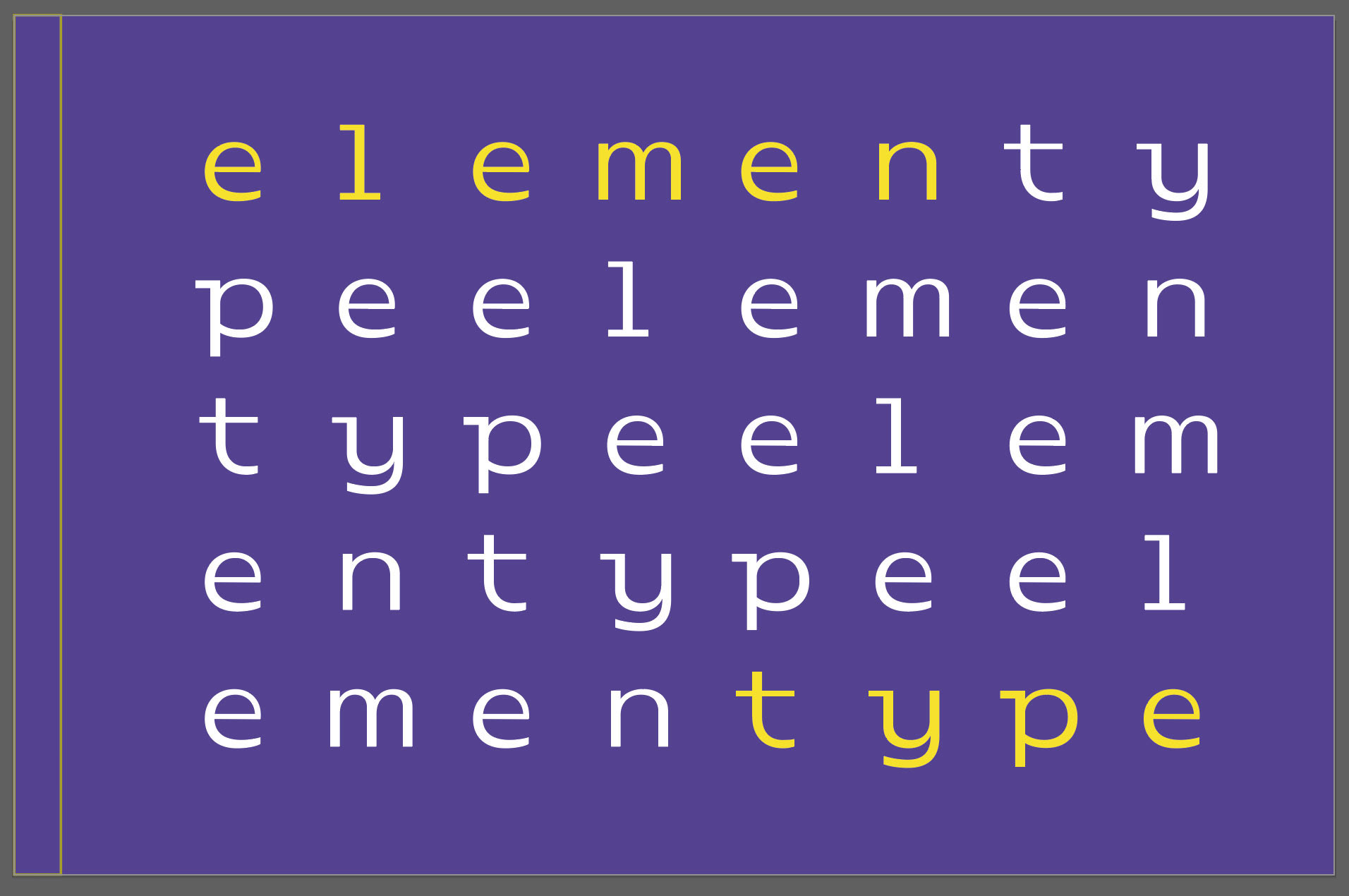
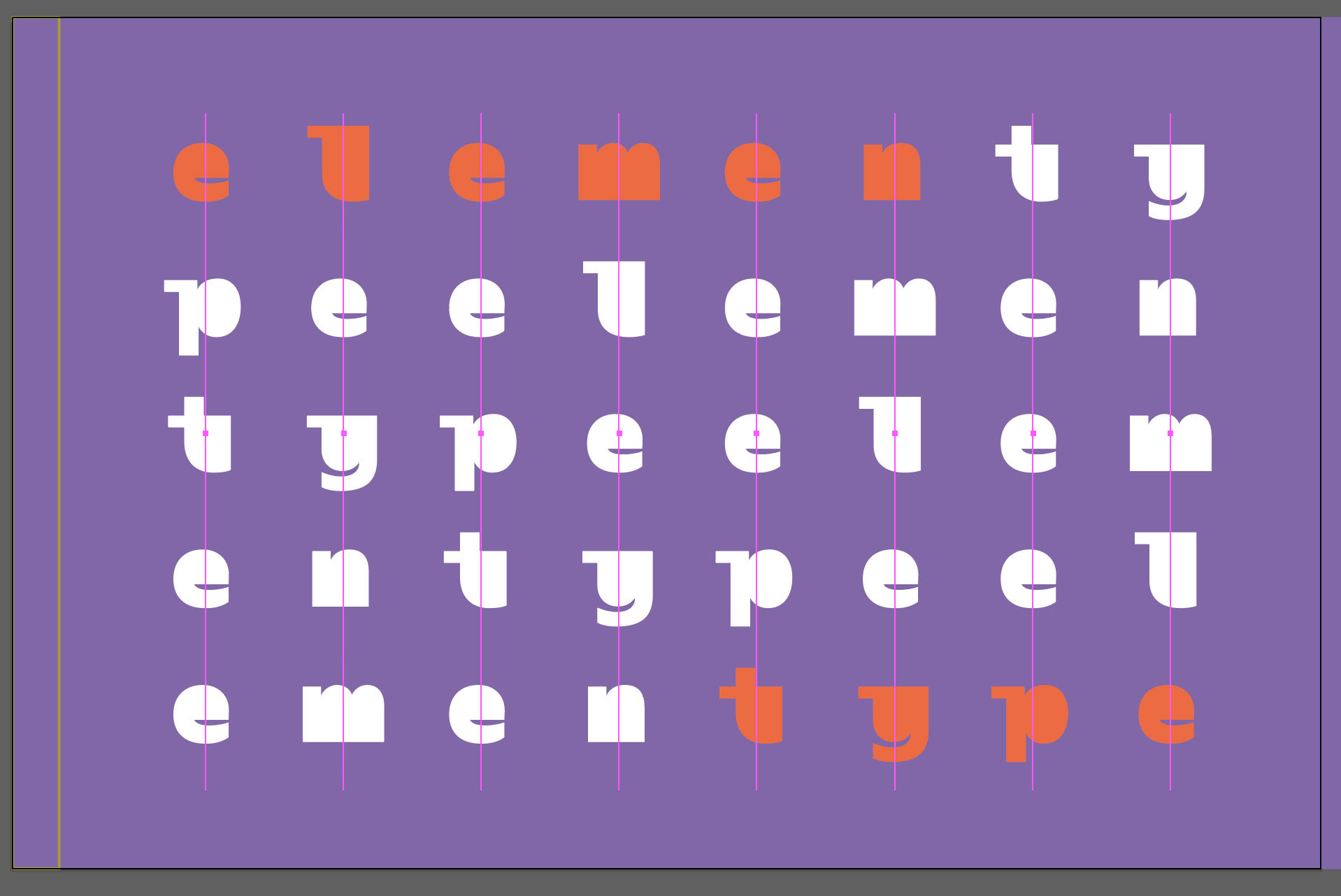
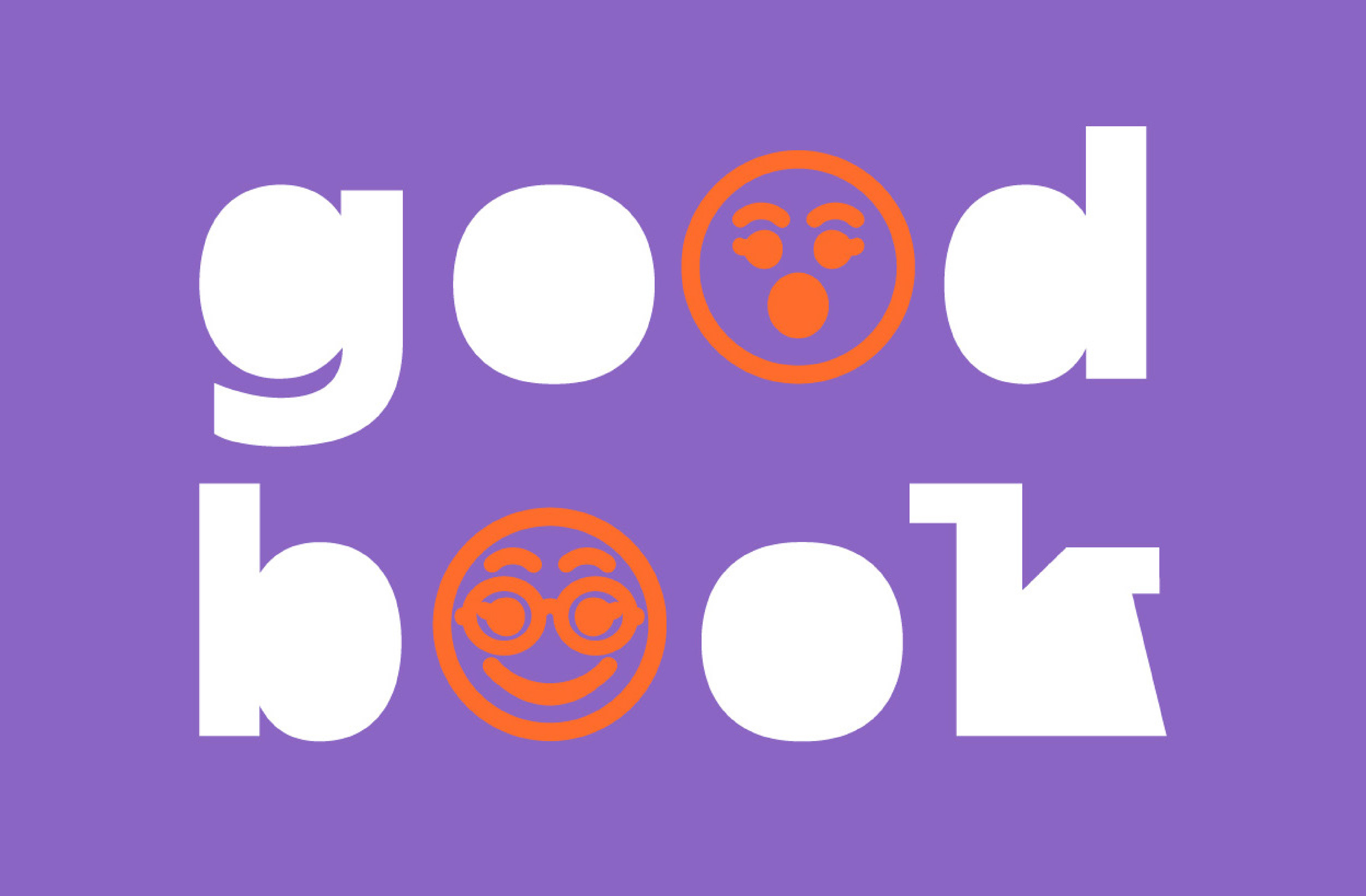
I ran several type design tests to find the right cover design path. I realized that I needed to remove information for it to work as a brand and decided to remove almost all the counter-forms of the letters. I explored, giving the letters a monospaced look so that they would occupy the same space on the grid vertically and decided to make their personality friendly as the language of the book.
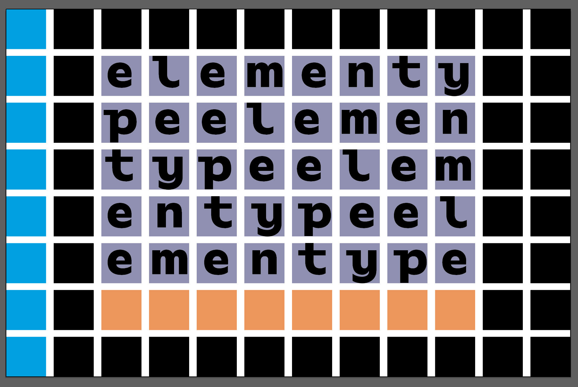
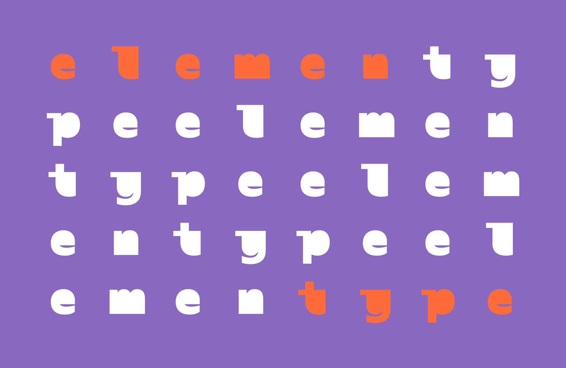
Final cover design
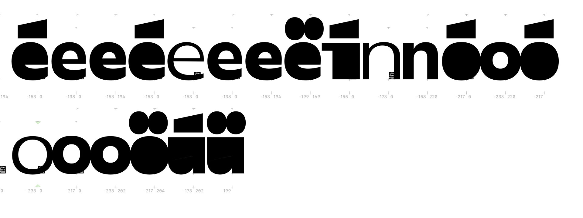
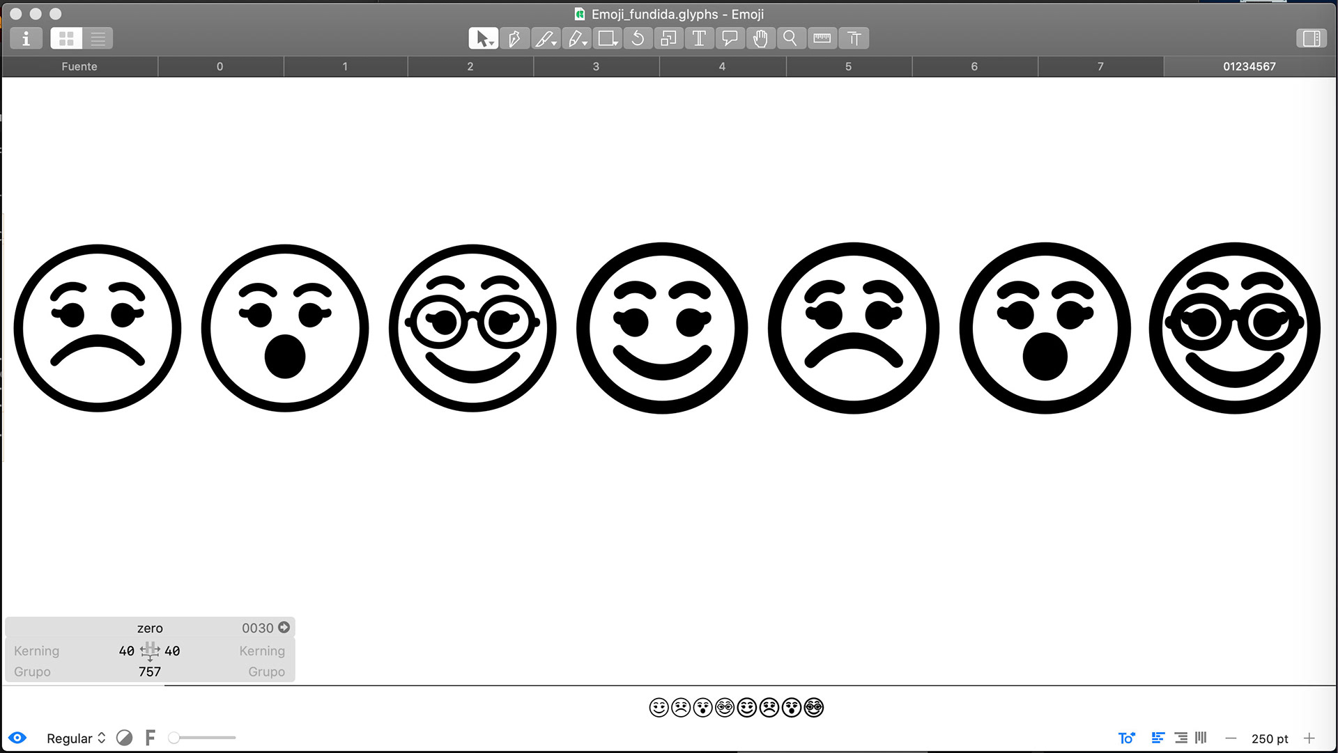
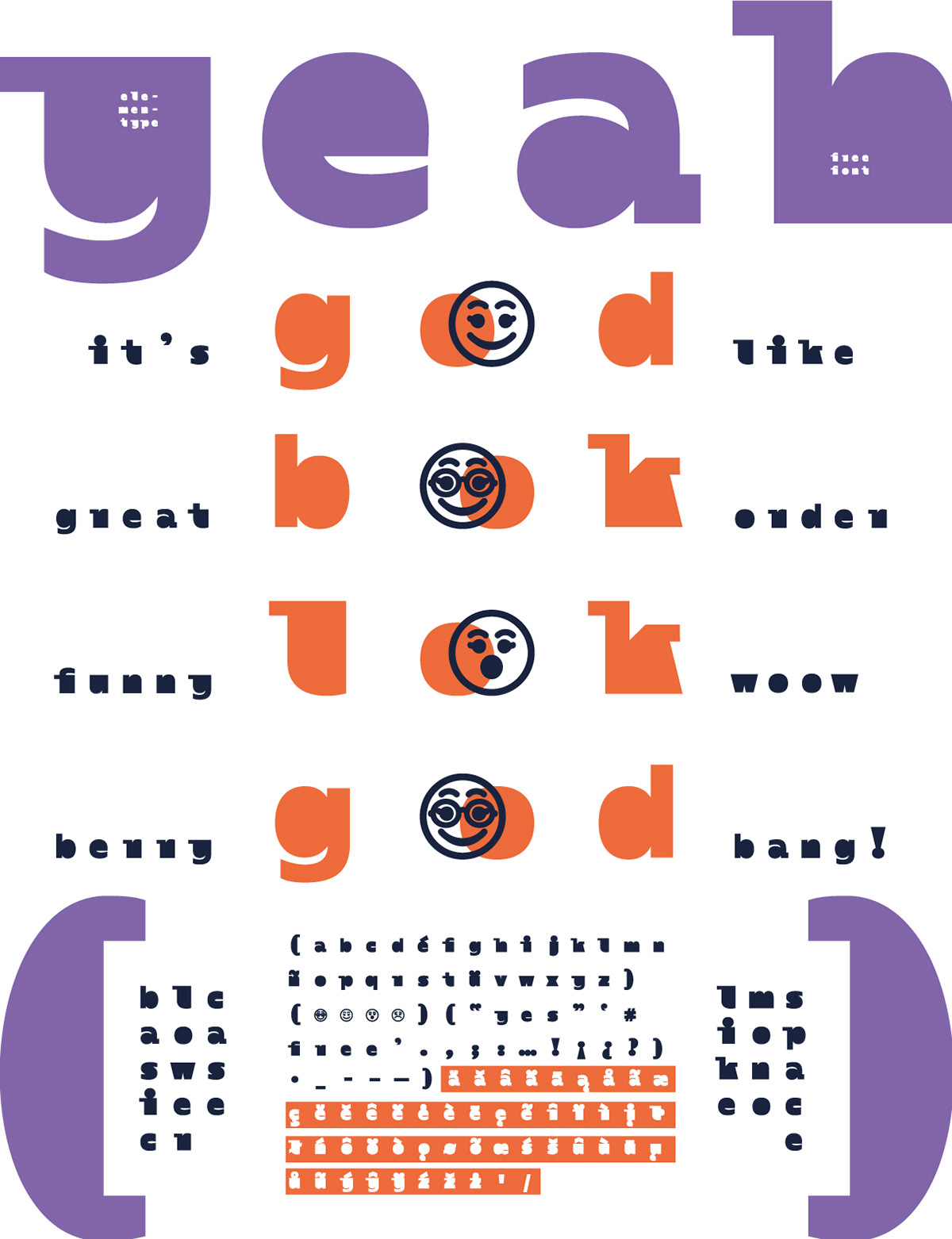
Design and weight testing of the emojis that would be used in the publication and in the gift font.


Layout, design, training & styles
Typographic selection
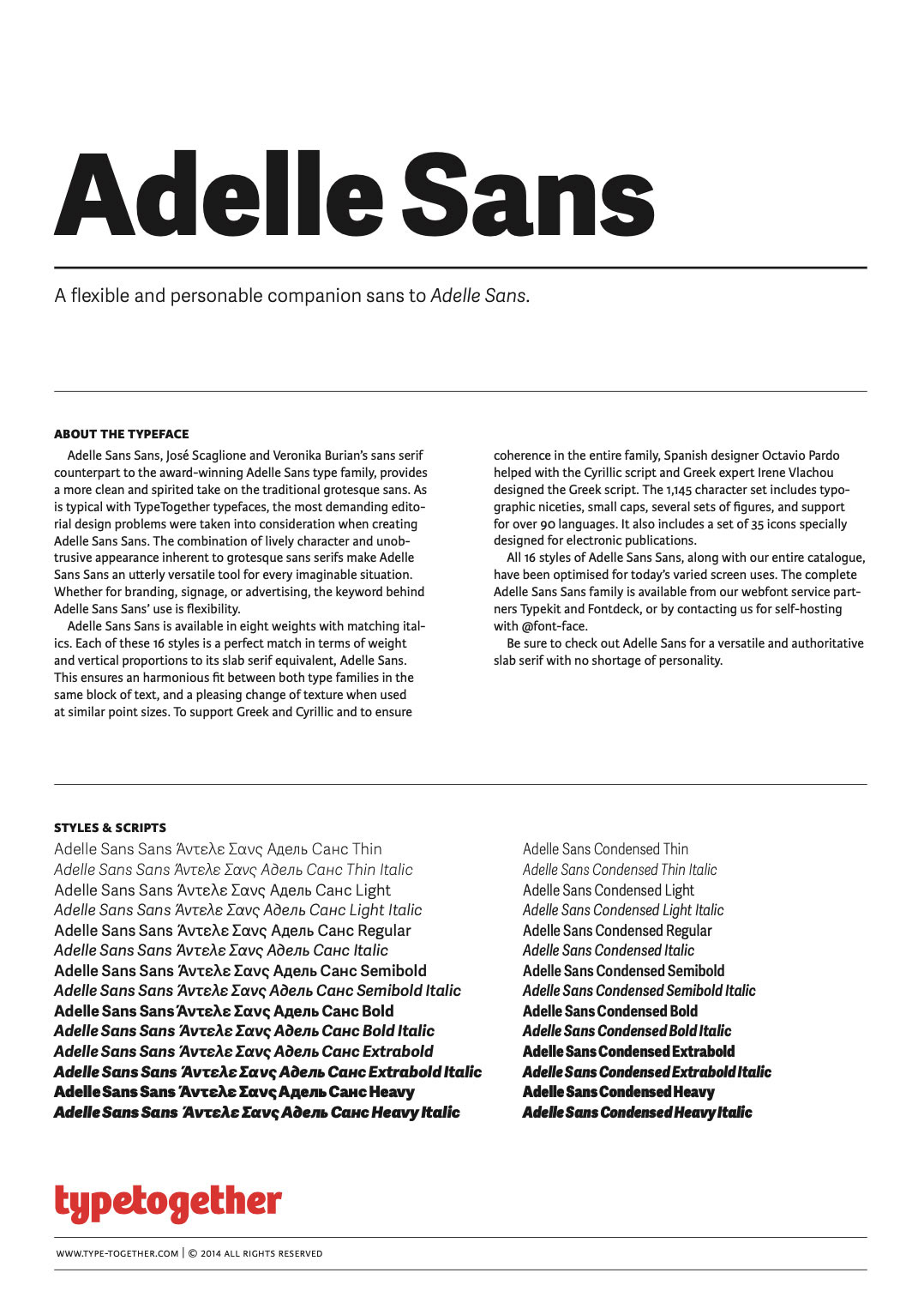
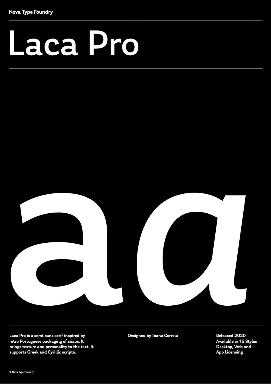
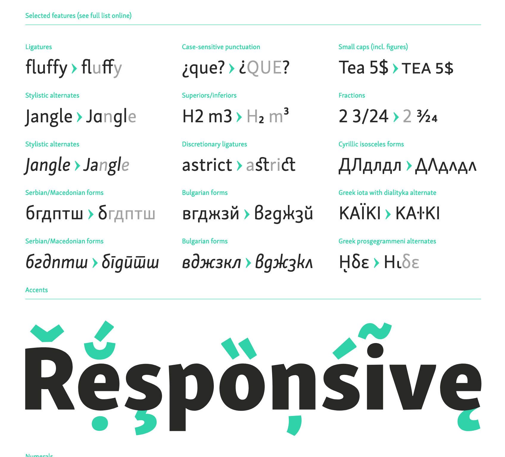
The search for the typeface to be used in the book was a bit tedious, especially due to the parameters required by the content of the publication. After looking for various font options that would comply with:
1. Being designed by a typographer woman.
2. Have a large pro set that had small caps, italics, several sets of numbers, multilingual, condensation axes, for example, for notes.
3. Be a sans-serif font.
4. Look formal but friendly.
2. Have a large pro set that had small caps, italics, several sets of numbers, multilingual, condensation axes, for example, for notes.
3. Be a sans-serif font.
4. Look formal but friendly.
These were my favorites, but only Skolar met what I needed.
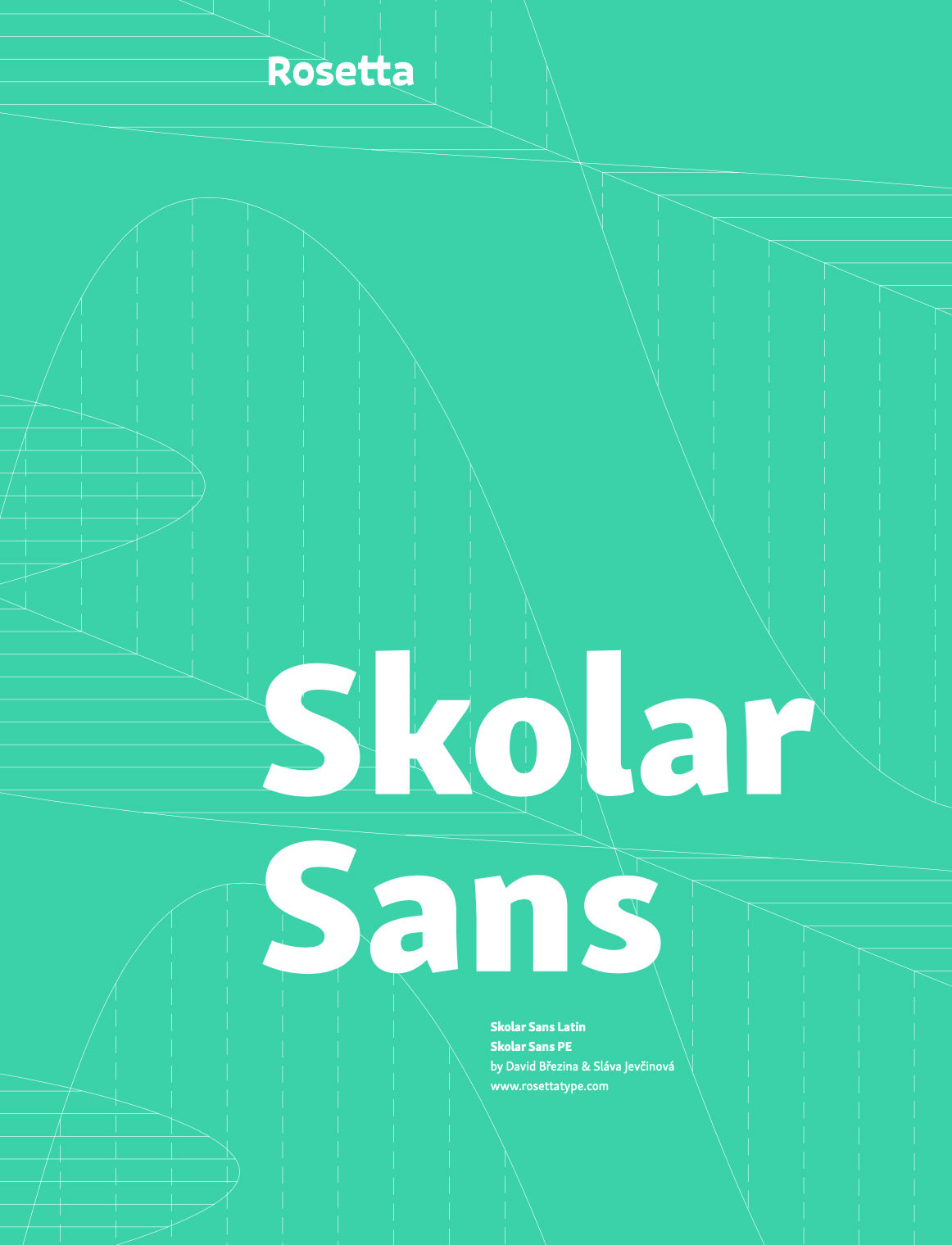
Rosetta specimen image
Gift typography design
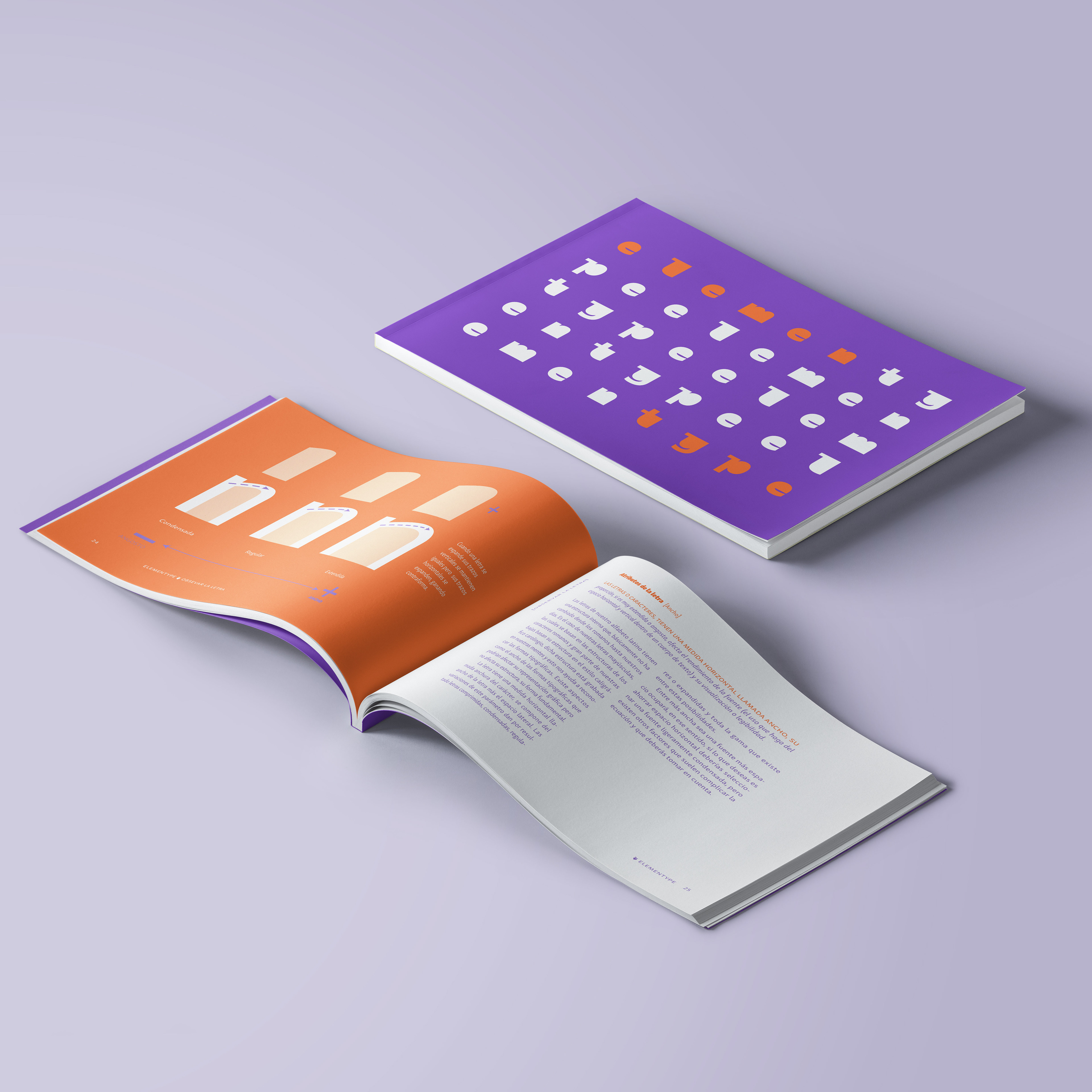
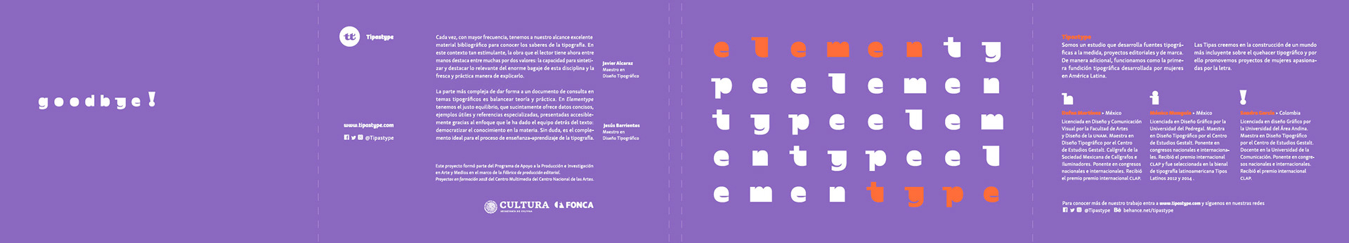
Elementype . Book in Spanish
Pay/Pague
Total: $27 USD o $575. 20 MXN
If you want to buy the book and you live in Mexico City, write to me at hi@momutype.com to arrange a nearby place, and you don't have to pay for shipping.
—
Si quieres comprar el libro y vives en la ciudad de méxico escríbeme a hi@momutype.com para acordar un lugar cercano y no tengas que pagar el envío.