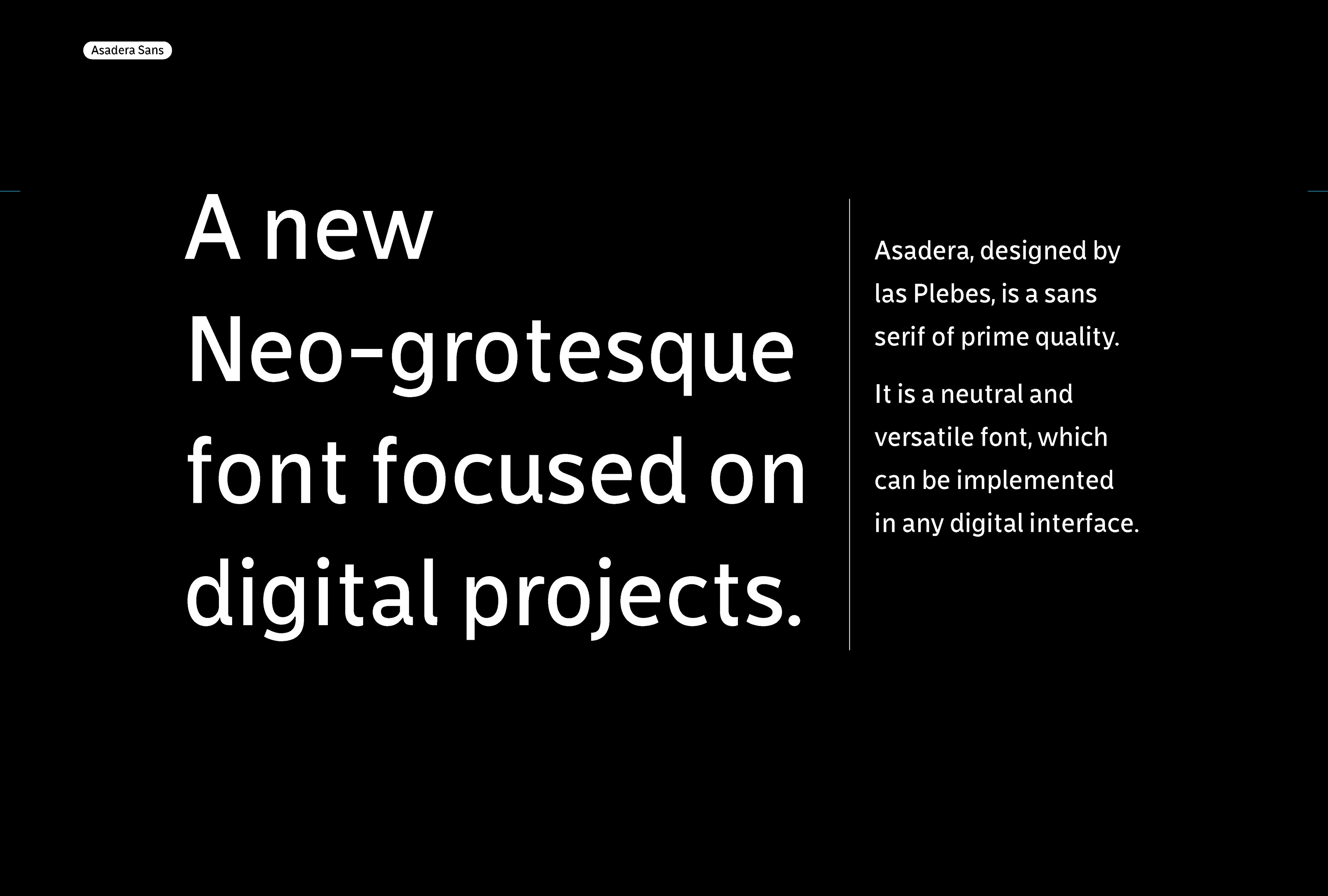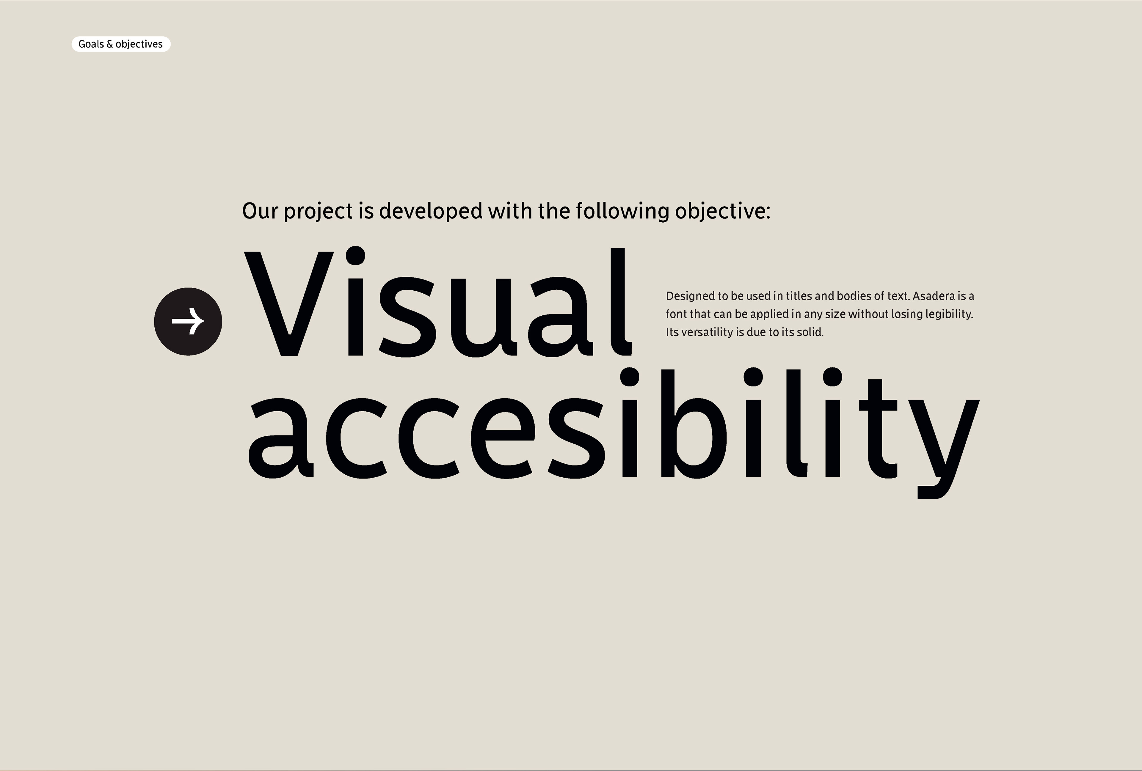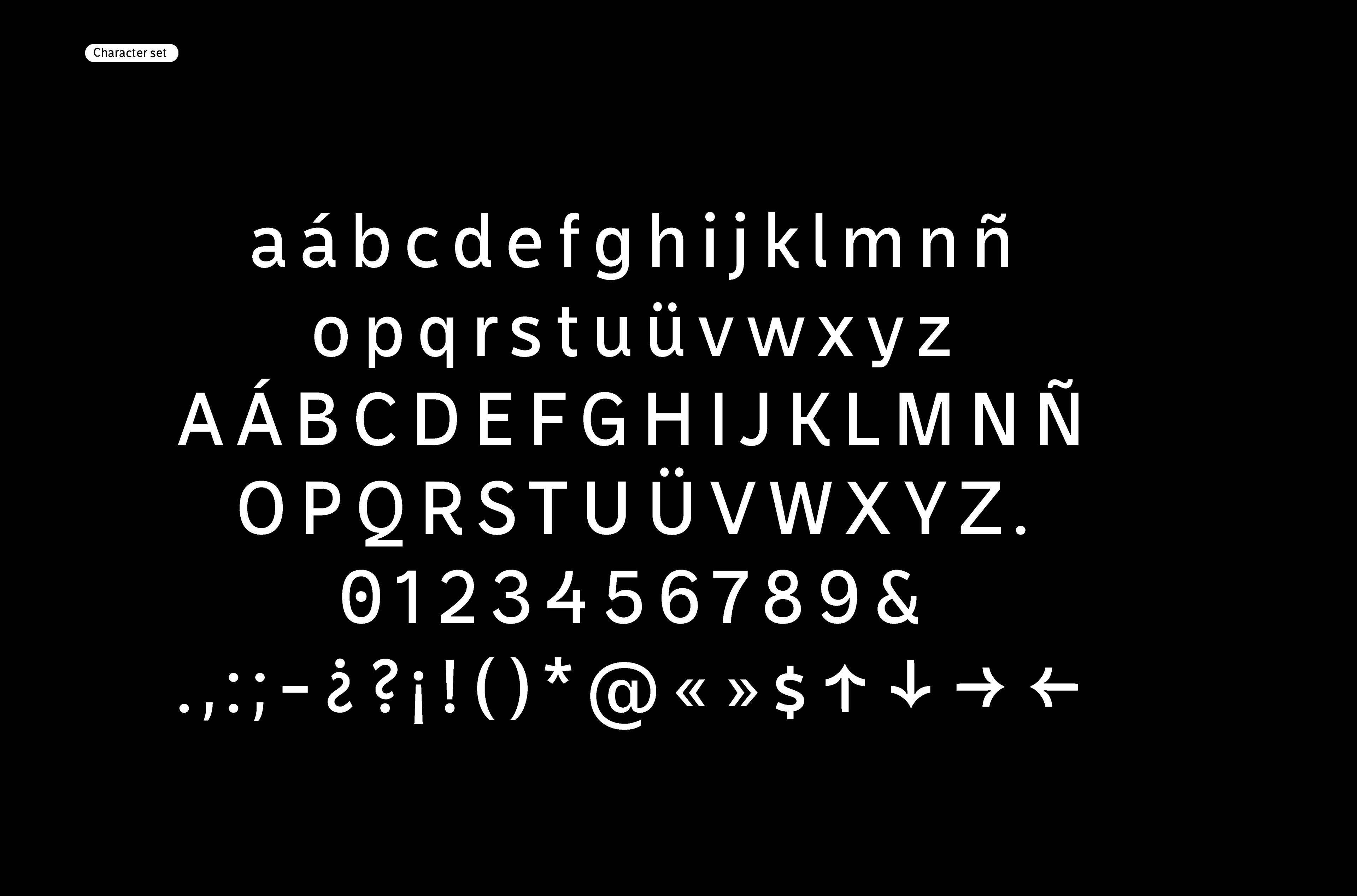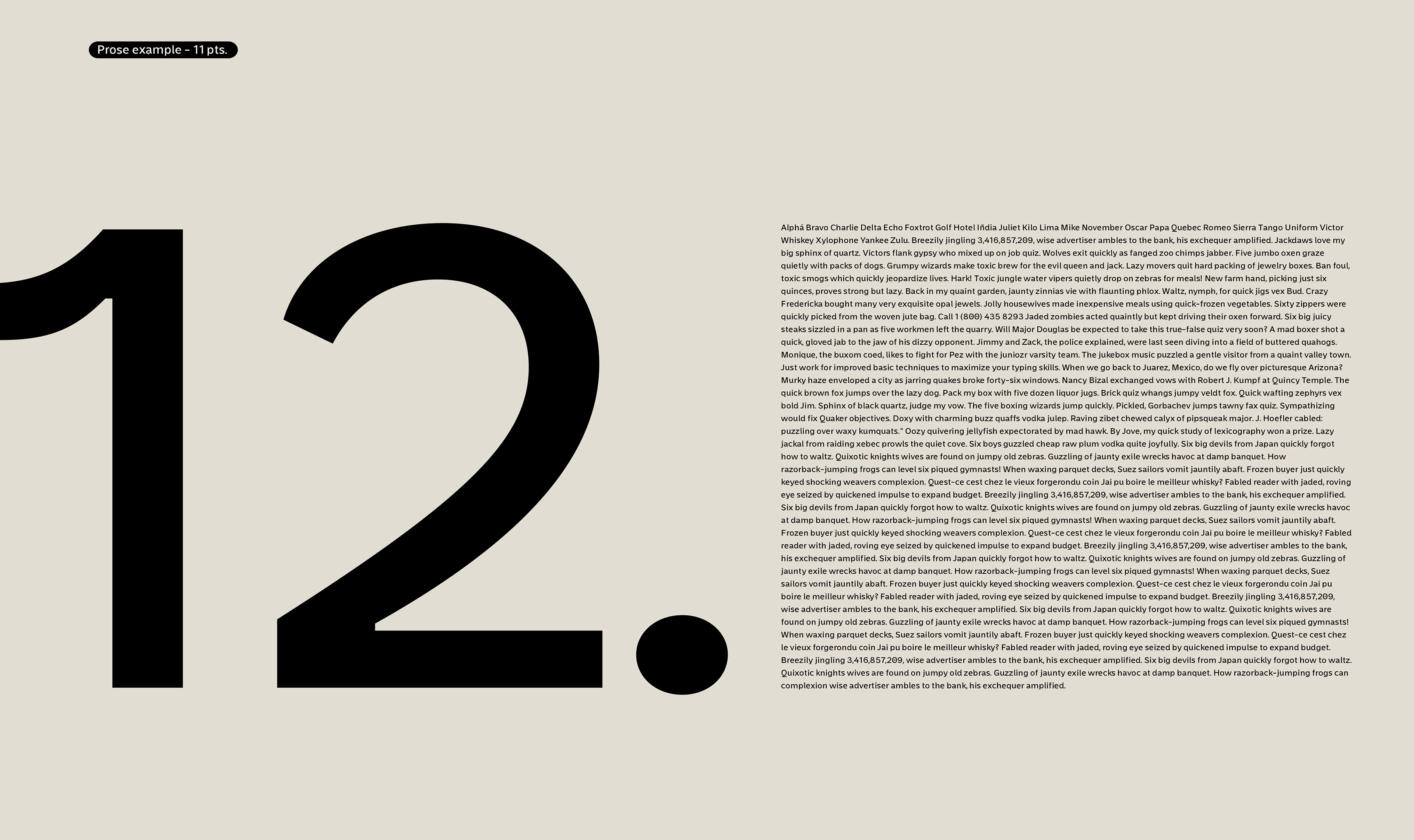
Asadera, designed by las Plebes, is a sans serif of prime quality. It is a neutral and versatile font, which can be implemented in any digital interface.
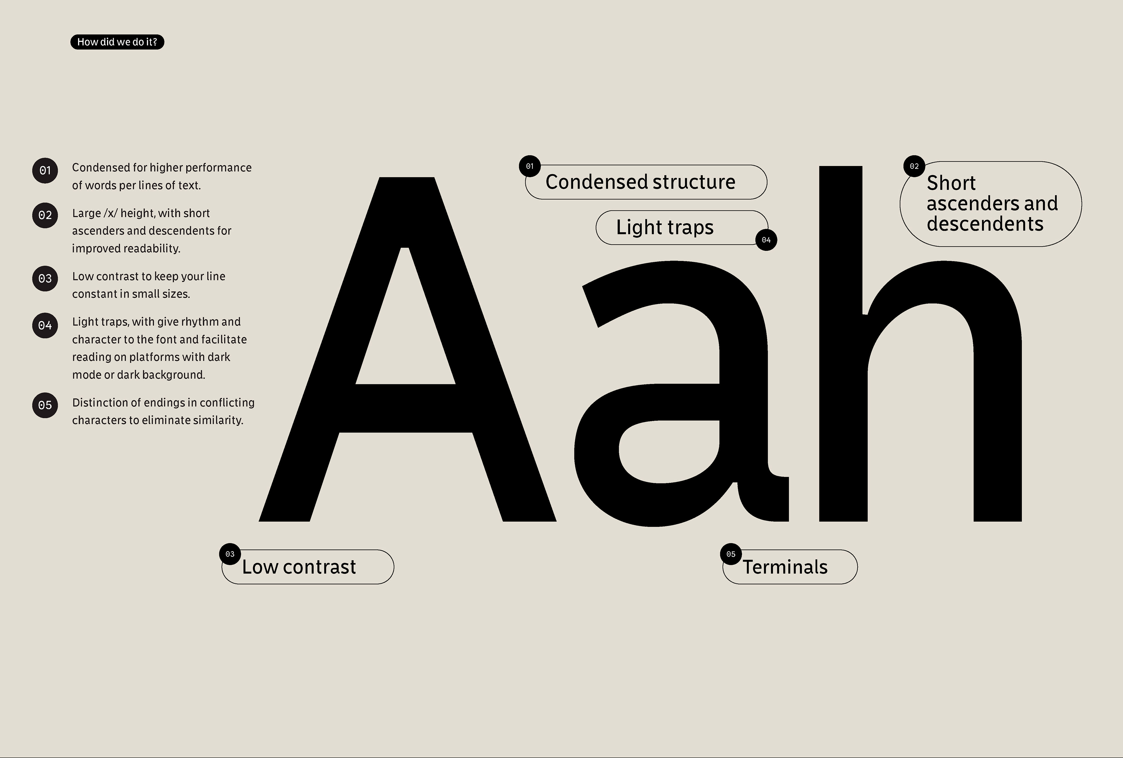
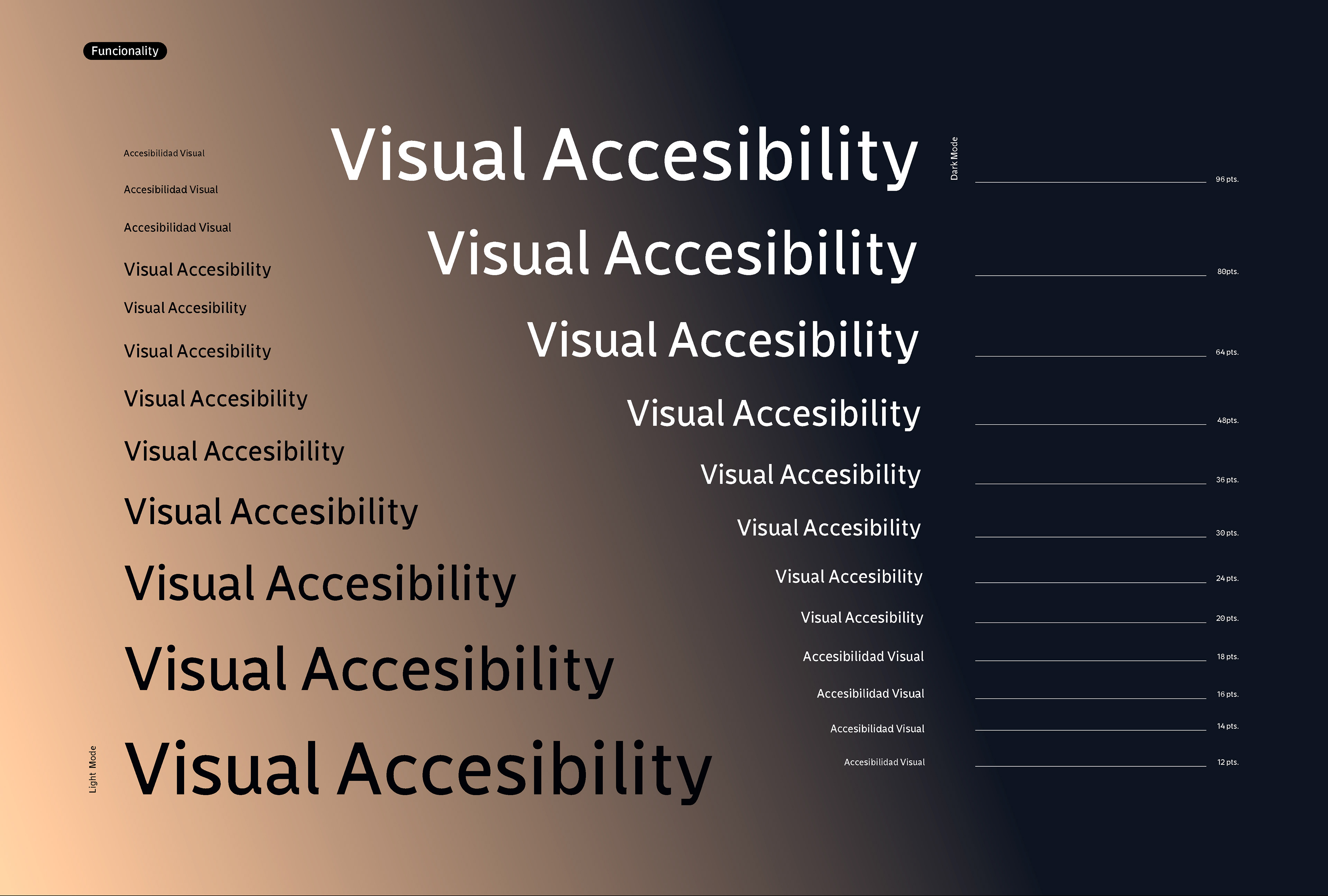
Is a Neo-grotesque font than features a low contrast, which is ideal to be used for UI and web projects. Analysing the most used web fonts currently (Roboto, San Francisco, Segoe UI, Relaway and New York), an taking into account that the typeface to be designed would be used in digital platforms and mobile applications, we note a constant in terms of the relationship that should have in the width of the height of /Xs/, short ascendents and descents, very little or almost no contrast between their strokes, and light weight.
We took these characteristics into account for the fist stage of our project, also seeking to obtain a condensed font that could add more characters per line in it use, it had to be a readable font in small sizes, where clarify and lightness would be essential. With this first approach, it was defined to make a font for text and present at least two proposals in pencil with the letters / a / i / n/ or by means of type cookers to explore but taking into account the observed characteristics.
Plebes Team
Leader . Monica Munguía Captain . Rebeca Anaya
Players . Jassiel Rivera / Karla Pasten / Nitzchia Díaz