
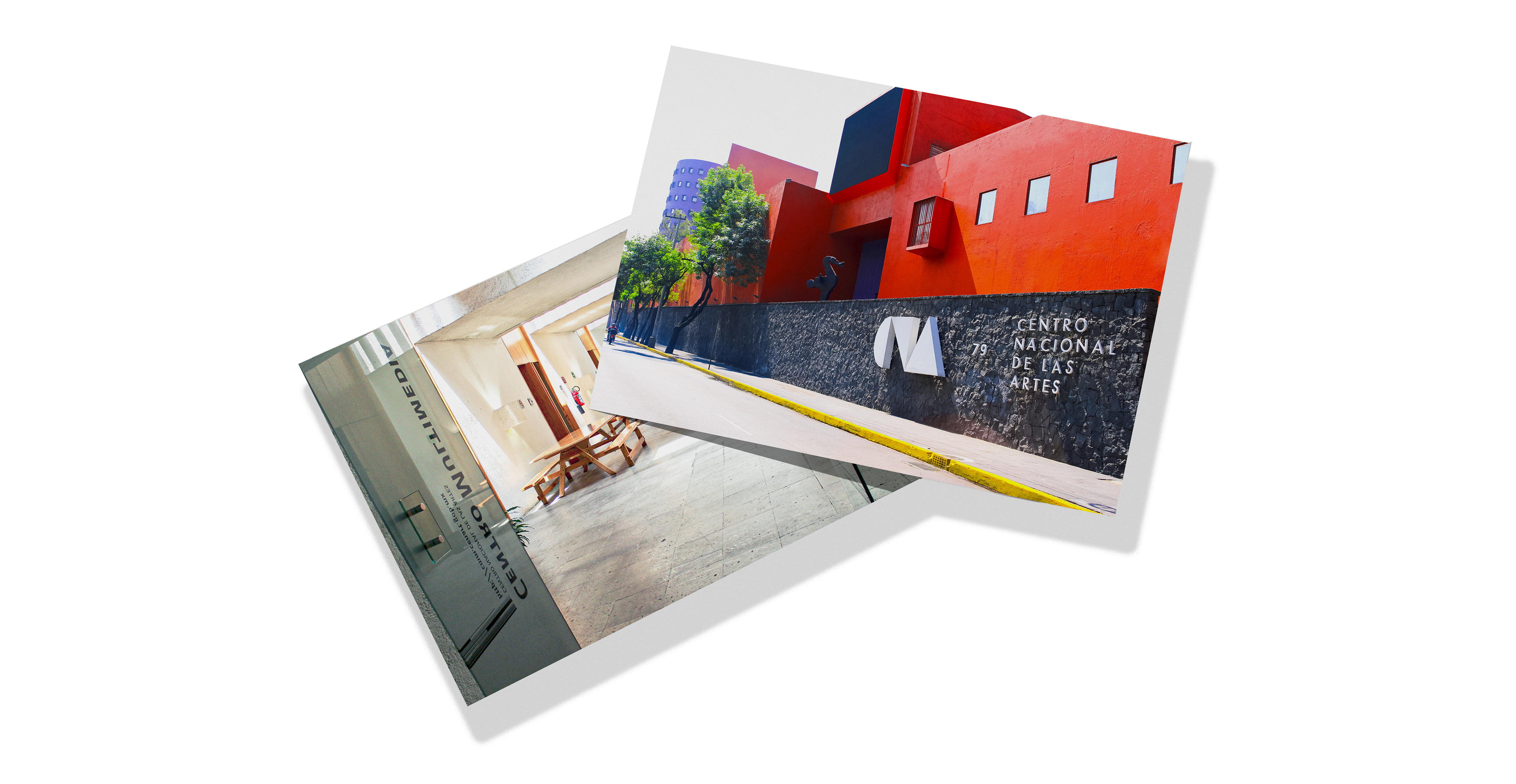
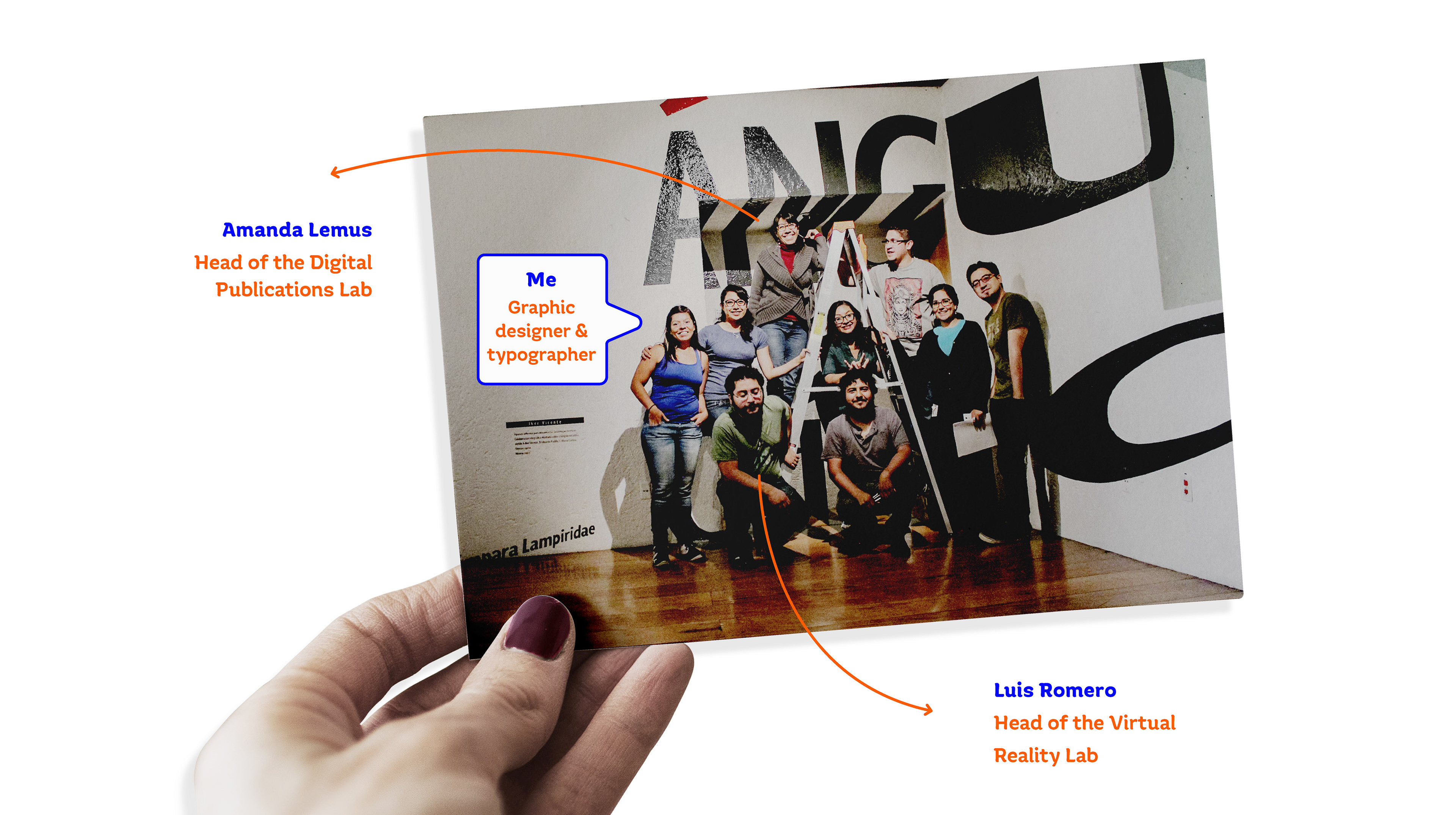
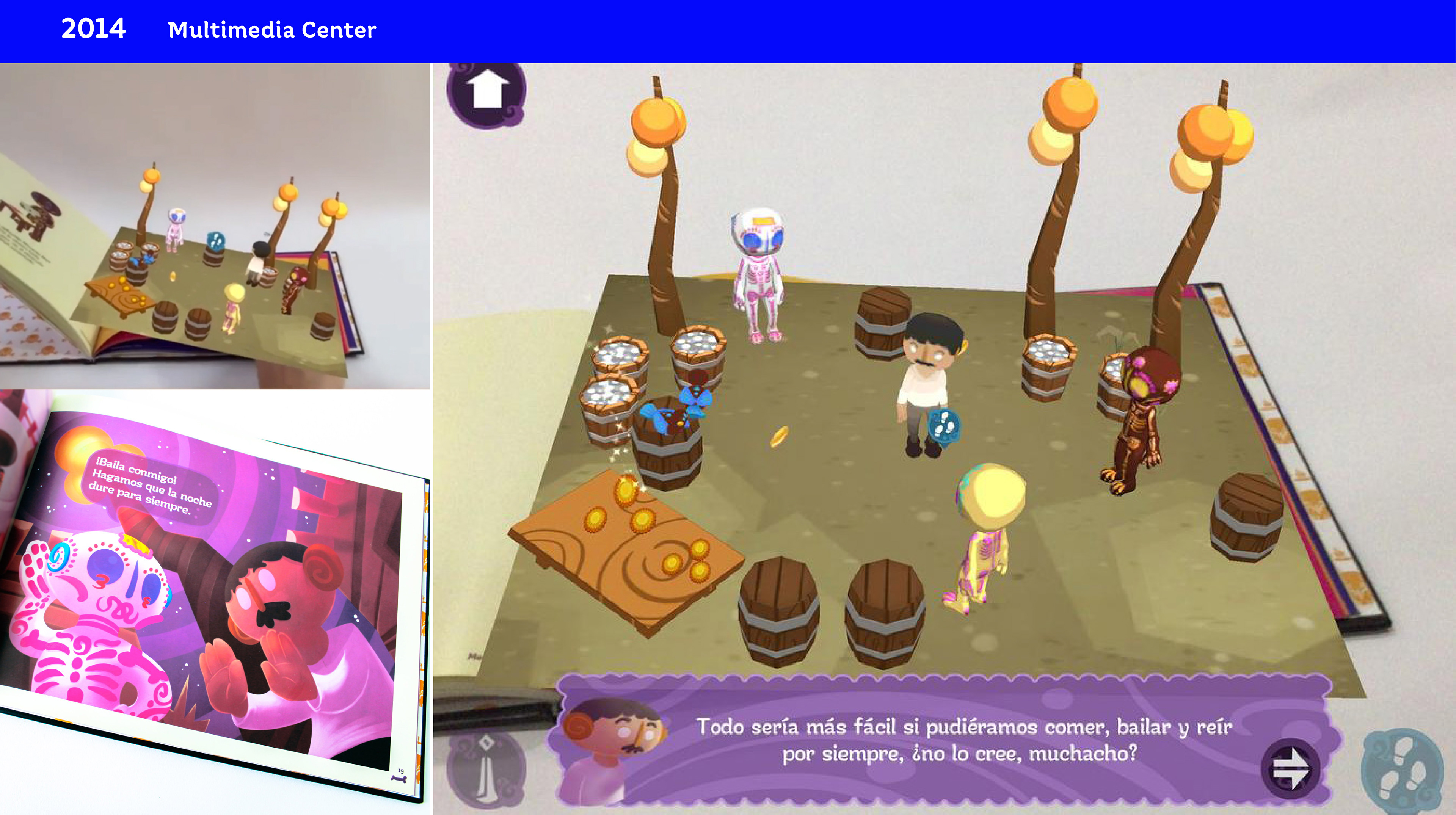
The first custom typeface that could develop six years ago. It all started in my former workplace at the National Center for the Arts, specifically the Multimedia Center, a space dedicated to experimentation, training, and research of artistic-cultural practices that involve new technologies, formed by different research and production laboratories. Specifically, the project was born from virtual reality and video games laboratory directed by Luis Romero and in coordination with the digital publications laboratory where I worked. My boss, Amanda Lemus, told me about the project, and I considered making a custom typeface, which I would take care of.
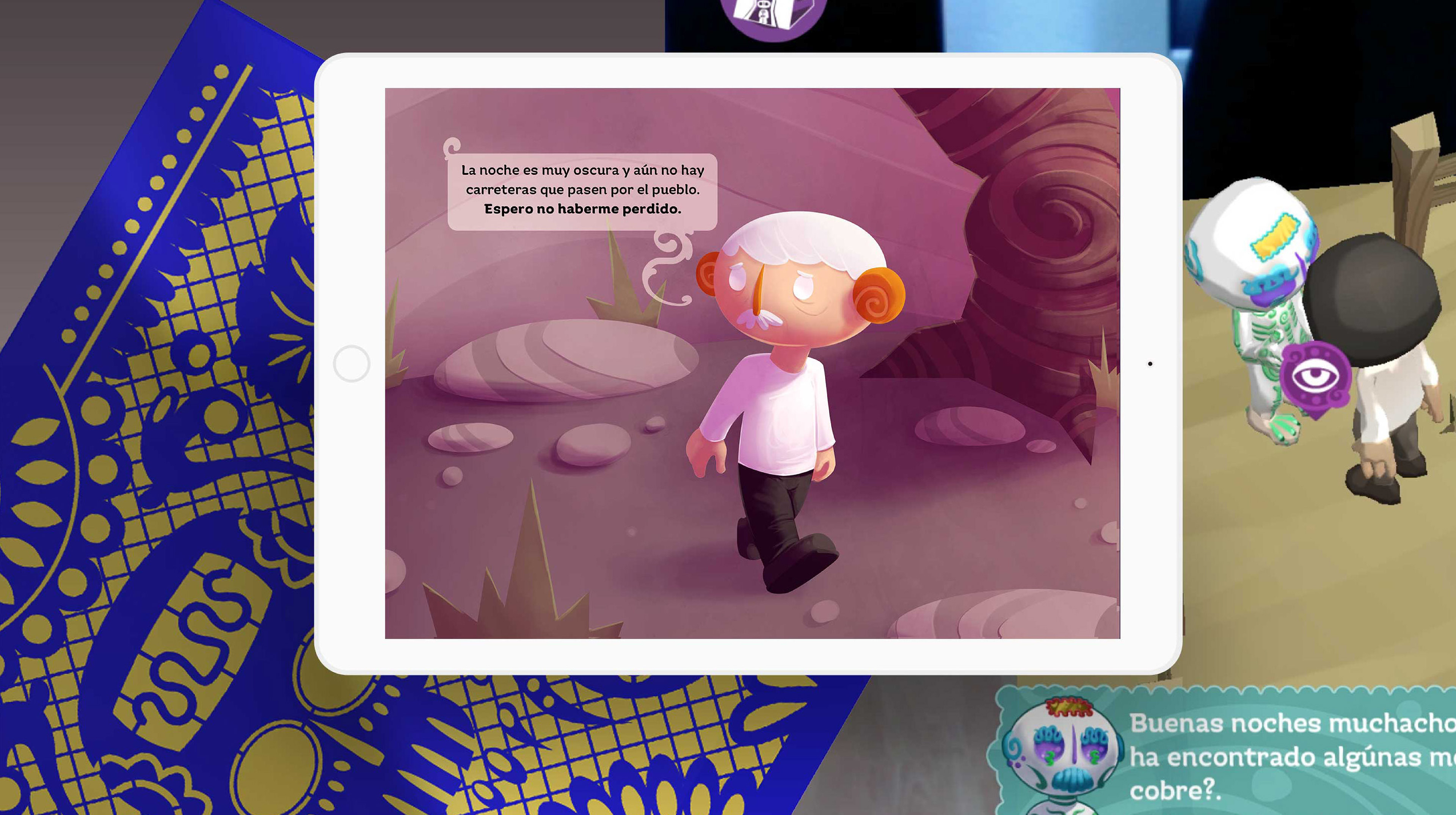
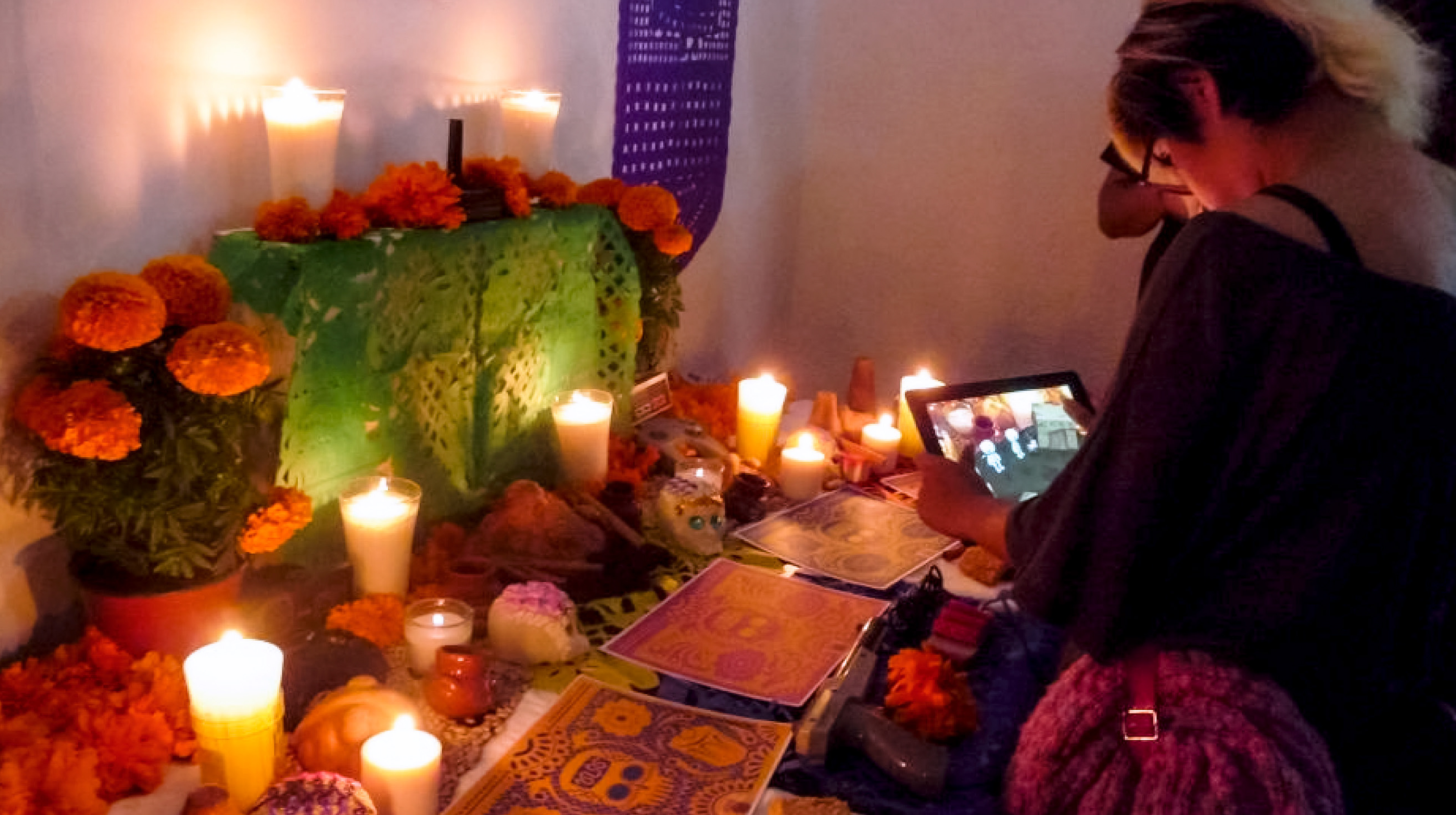
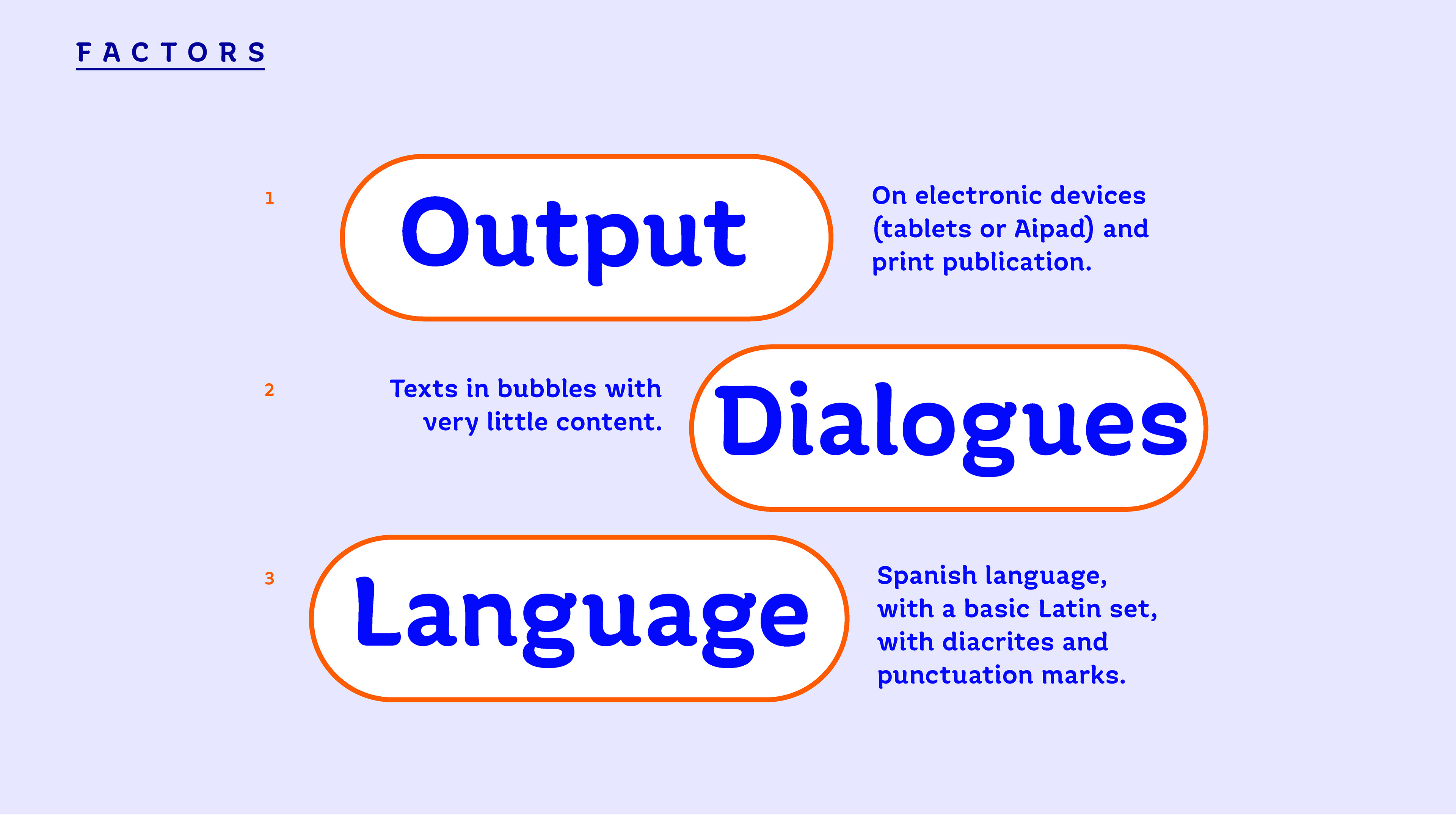
The project consisted of designing a typeface for the interactive book Memento Mori. Its output would be digital through the video game in augmented reality using an electronic device, in this case a tablet or iPad, and at the same time a series of patterns that are scanned from the story in its printed version.
It is a hybrid of the video game, the art installation, and the interactive book.
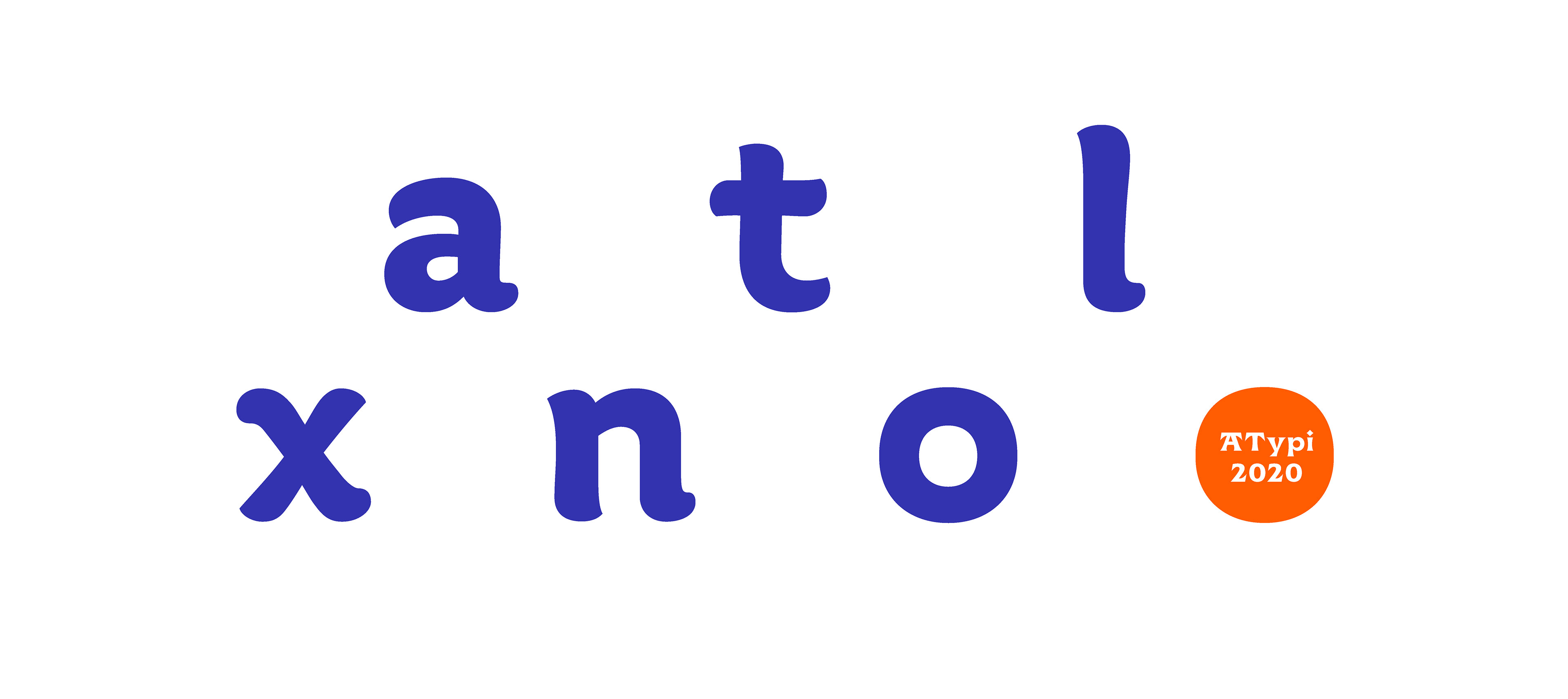
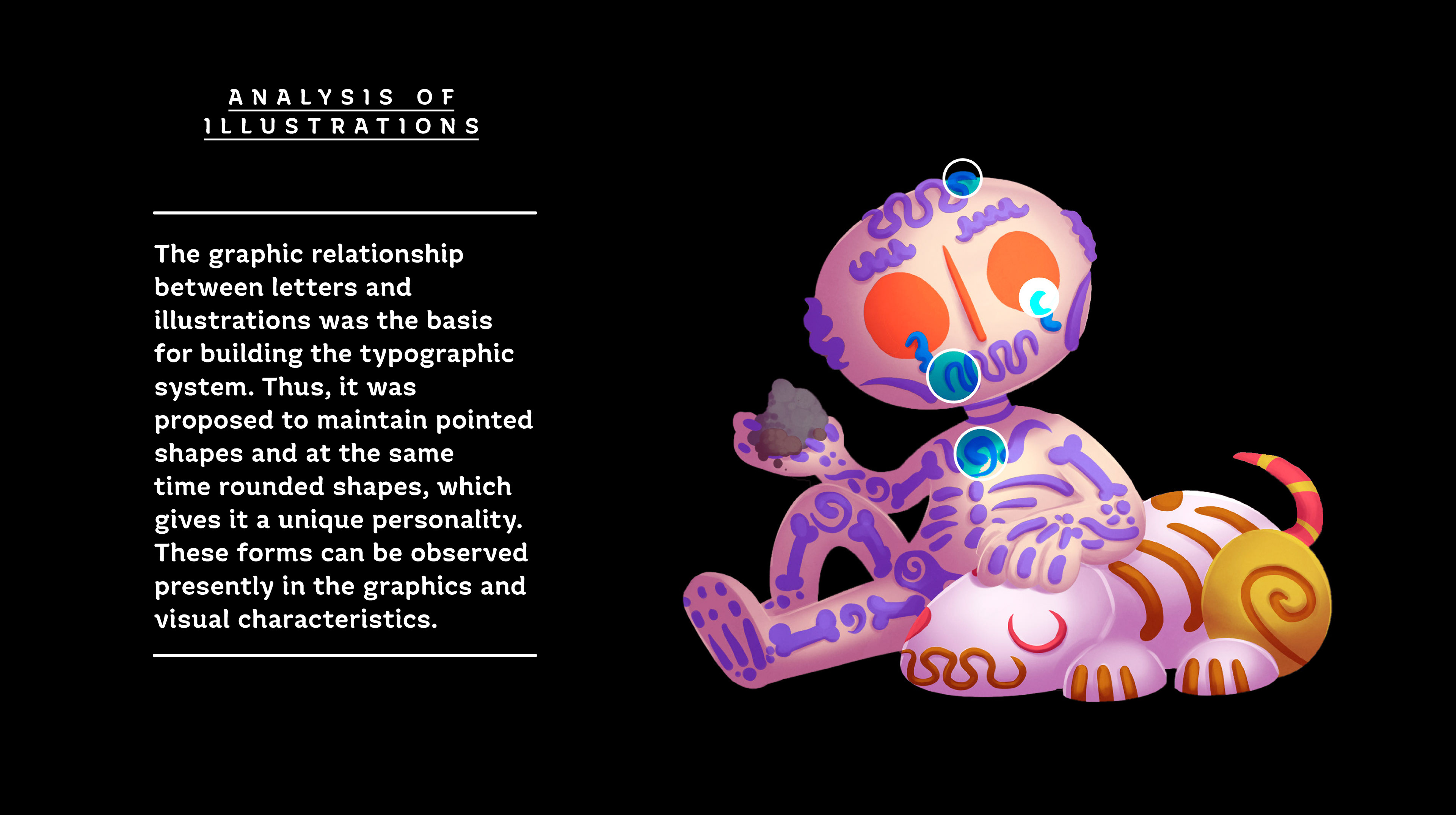
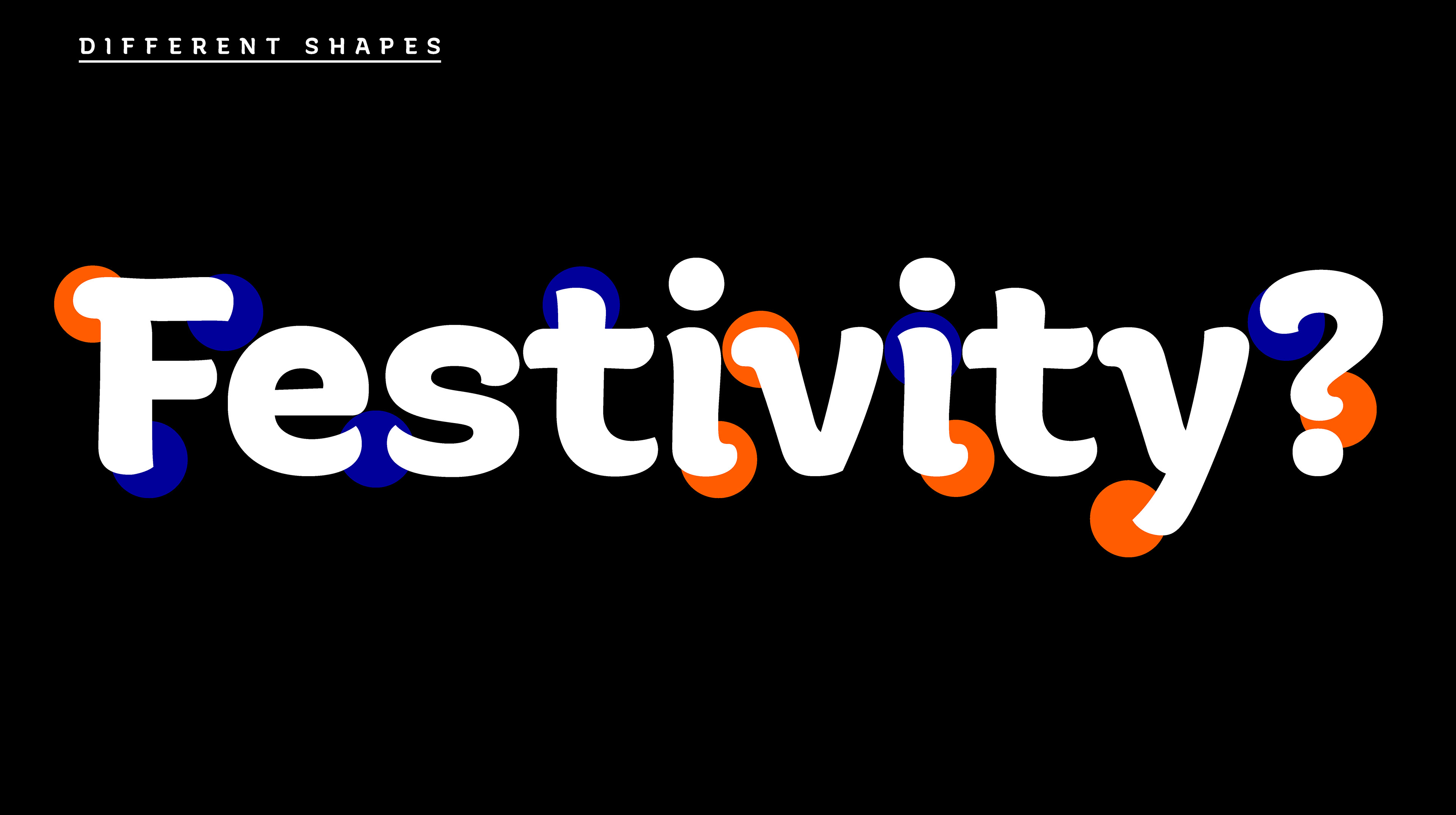
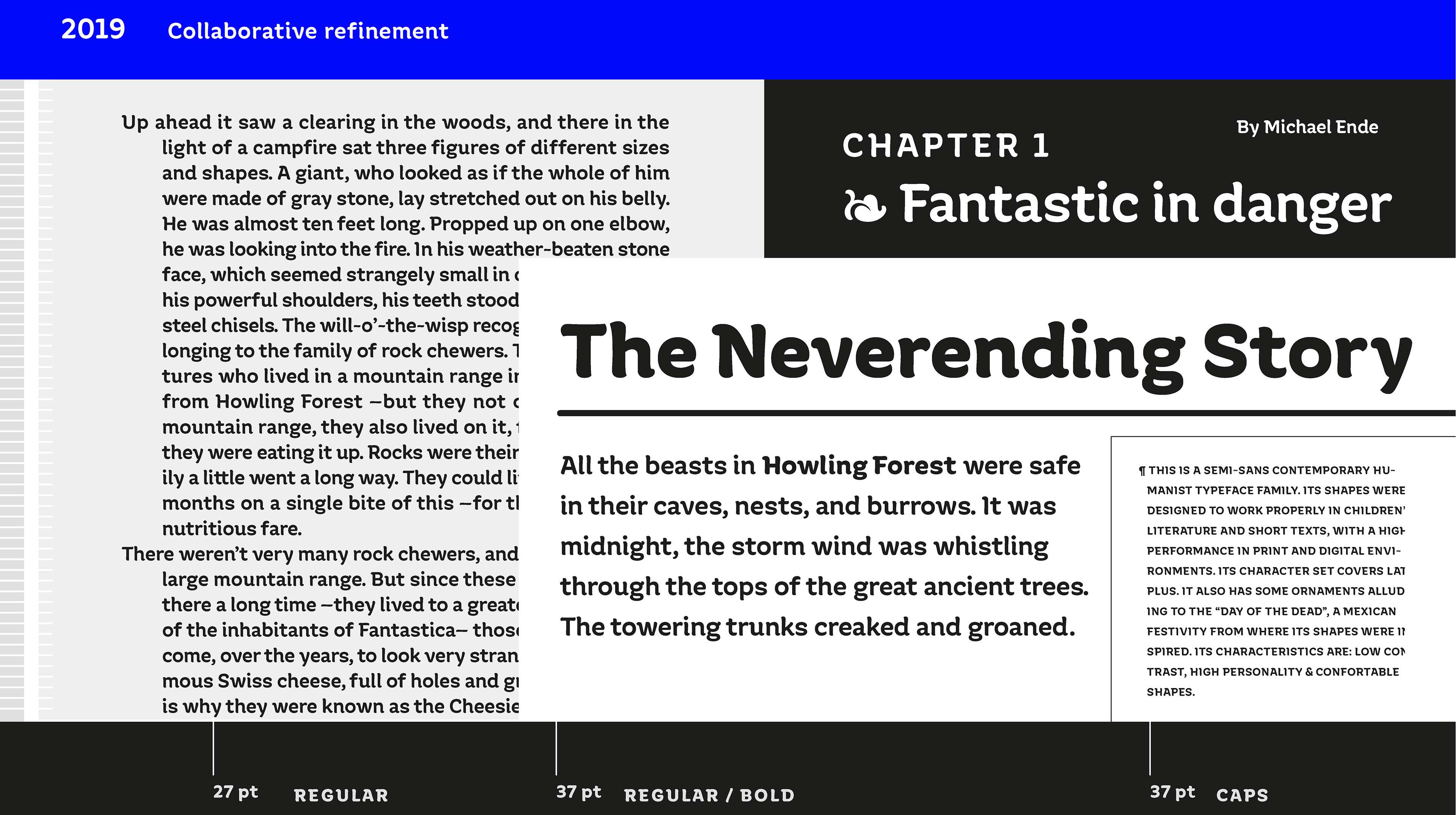
The graphic relationship between letters and illustrations was the basis for building the typographic system. Designed to work well in children's literature and short texts, it is a humanist semi-sans typeface that in its forms is inspired by the celebration of the day of the dead in Mexico.
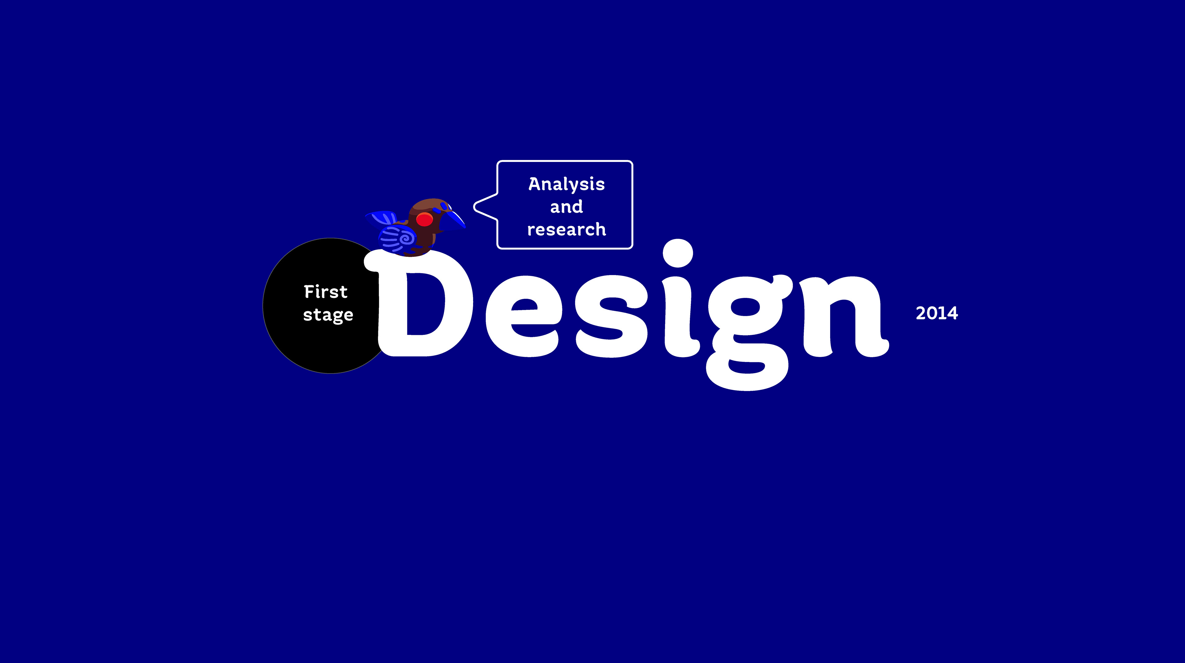
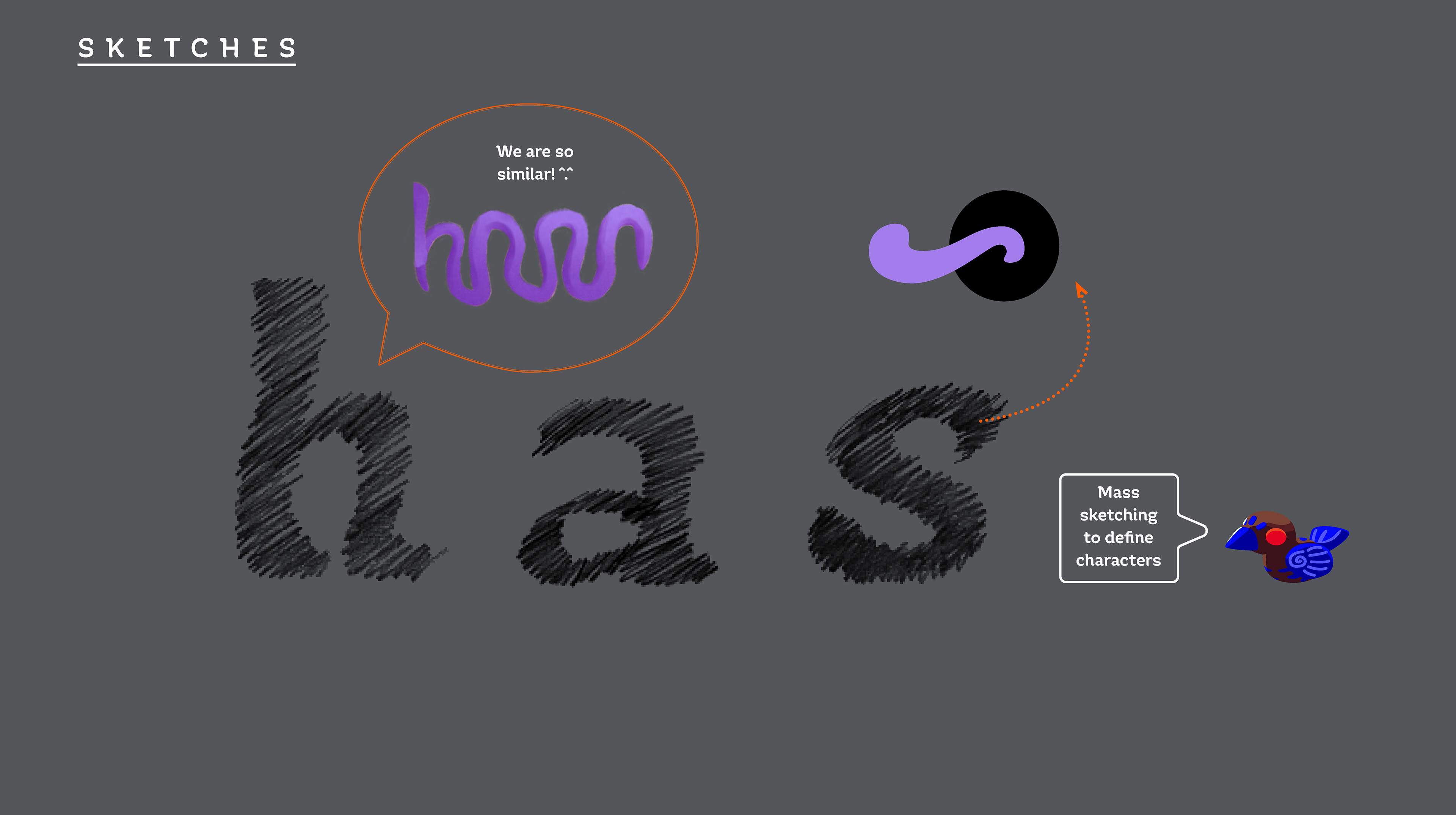
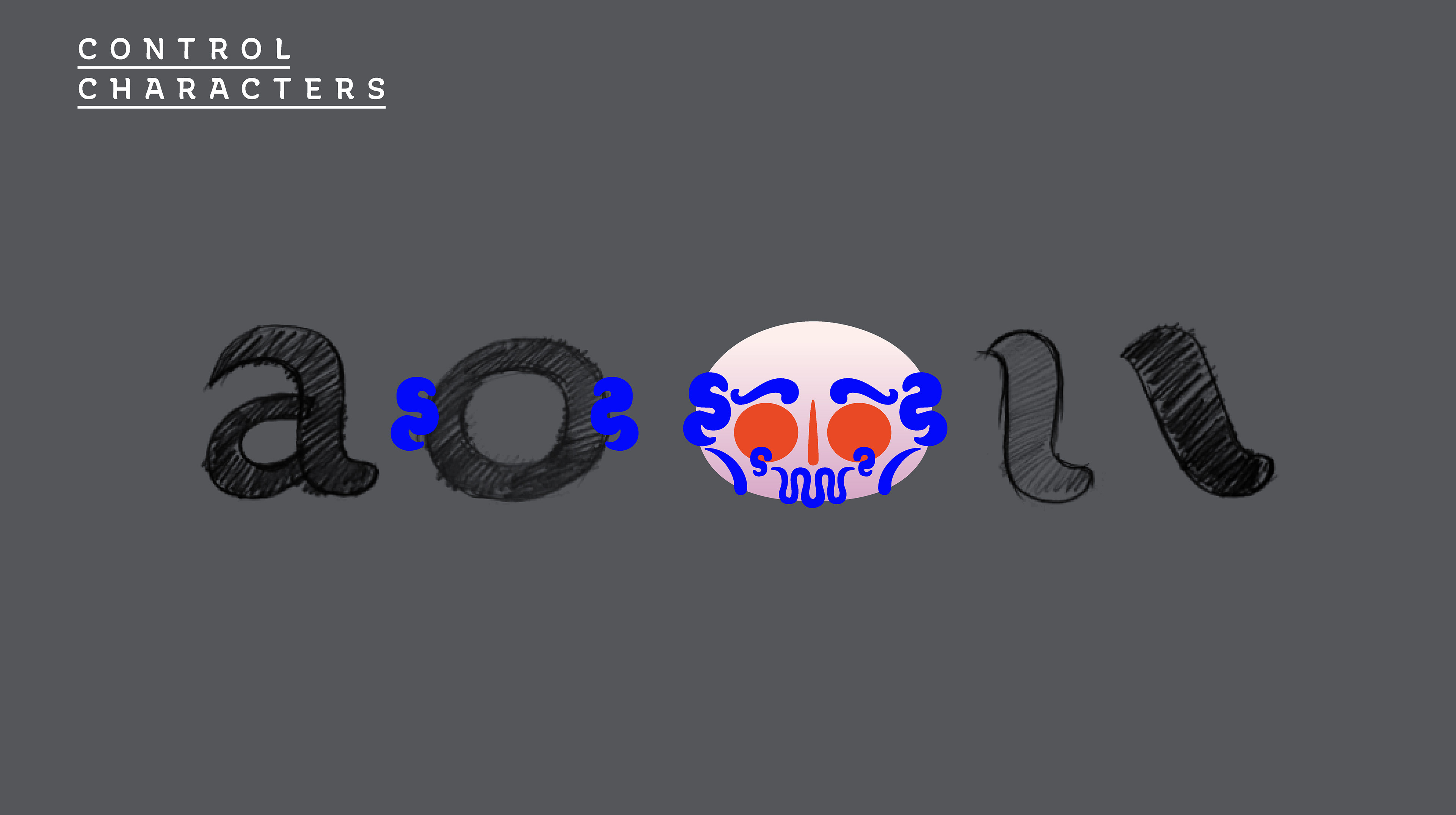
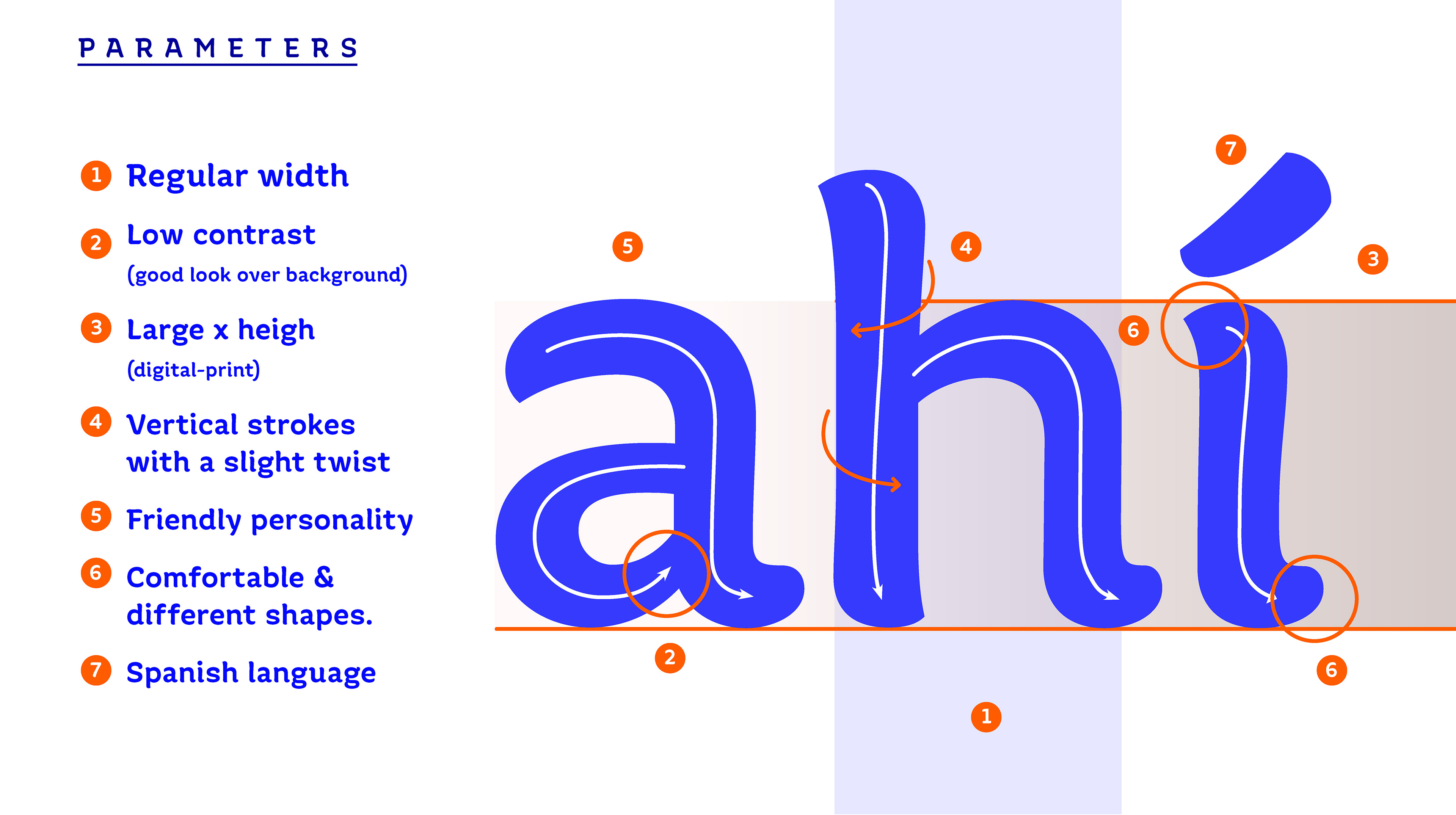
There were three important stages of the project. The first, as we mentioned well, consisted of developing the typographic system, its structure, proportions and features, that is, its particular style and personality based on the illustrations. This first version was implemented in the Memento Mori project. The second stage took place when I took the master's degree in typographic design in Mexico. Its striking personality was stabilized, the contrast was reduced, the height of X was gained with shorter ascenders and descendants, its proportion was condensed, the twisting of the shafts was more discreet and the rounded and pointed ends were unified. The Uppercase ones had a greater design, the old-style figures set, italic and small caps were designed.
Undoubtedly the stage of greatest graphic maturity of the project, and with this second version I concluded the master. The third stage consisted of expanding the set for commercialization in a recent foundry. It was developed collaboratively to be able to grow the typeface family and add the variables bold and bold italic. It was also fortunate to be reviewed by an expert with more typographic experience, managing to stabilize weights and vector drawing adjustments. However, this stage could not be concluded, but there was great learning since the inexperience working in a collaborative way.
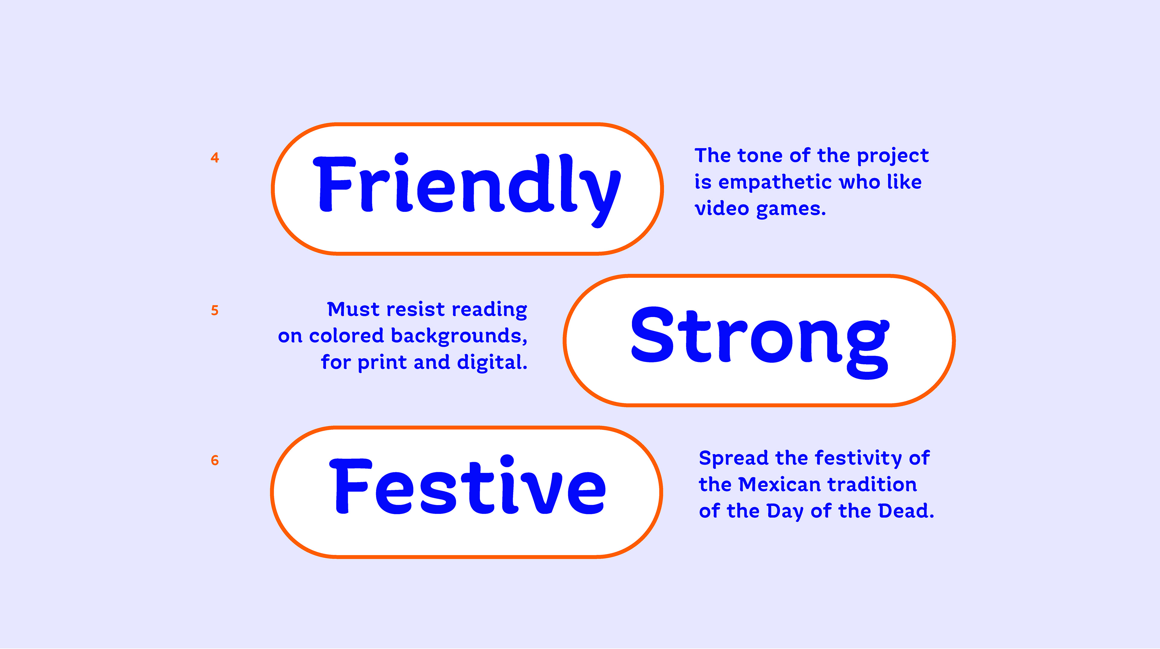
Xantolo's design has been intended to be an identifying and representative part of the Memento Mori project. The key concepts that helped to establish its essence come from the symbolic charge of the project itself, they refer to festivity, tradition, decorating; connotations that manage to link the project with its typography.
Among the many satisfactions this project has brought, in 2017 we were honored to have it chosen for the Clap awards, International Design Awards, in the category best font design for titles.
They are one of those moments that really motivate you to continue designing fonts and understand that it is often a slow process, but perseverance is the main thing.
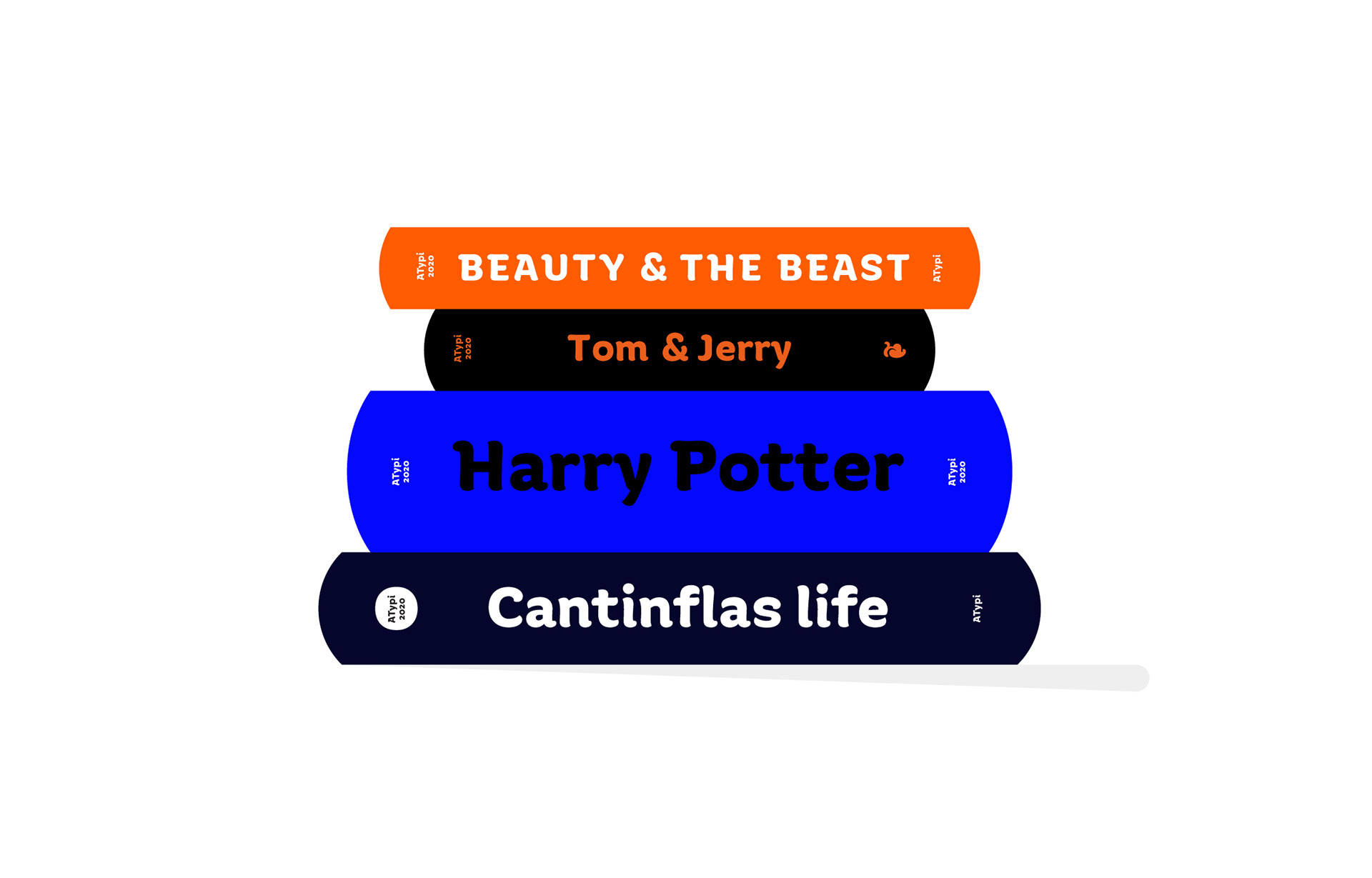
Ideal for children's literature texts, packaging, labels, logos, it is a versatile typeface with a great personality.